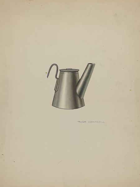
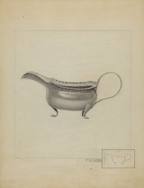
drawing, graphite
#
drawing
#
geometric
#
graphite
#
modernism
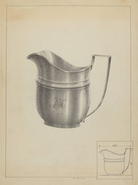
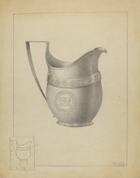
Dimensions: overall: 30.7 x 23.1 cm (12 1/16 x 9 1/8 in.) Original IAD Object: 4 1/2" wide; 6 3/8" long
Copyright: National Gallery of Art: CC0 1.0
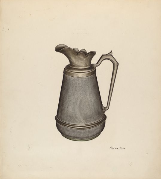
Curator: I find Simon Weiss's drawing of a "Silver Creamer" from around 1936 particularly evocative. There's something both straightforward and incredibly skilled about how he captures this everyday object in graphite. What catches your eye about it? Editor: Immediately, a strange sense of austerity hits me. It’s beautifully rendered, absolutely, but it also feels a bit… clinical. It reminds me of product design sketches—a far cry from the cozy associations of tea service. It’s stripped down, streamlined. Curator: Exactly! It's that blend of the functional with, dare I say, the poetic that interests me. Weiss clearly engages with modernism here through geometric visual objects— taking this familiar vessel and elevating it, not by embellishing, but by reducing it to its essence. It reminds me of those moments when you find surprising beauty in mundane forms, in everyday life. Editor: I agree, it is intriguing how such simplicity also speaks to certain societal changes of that time. We see the focus shifting to objects that could be easily manufactured and reproduced. I see how he isolates this Creamer as the primary actor within the sketch. He's giving us an intimate perspective on consumerism during this period, inviting reflection of those ideas and themes on Modernist tables. Curator: Absolutely. Plus, look at the craftsmanship itself. The subtle gradations in the graphite, how it gives the illusion of polished silver. It's like he's paying homage to the very act of creation, drawing, as if making silver from the pencil itself. Editor: Indeed. And, on the symbolic front, silver is often linked to reflection, clarity, but also with wealth and status. By simplifying its form in graphite on paper, maybe Weiss critiques the object itself. Curator: Yes, almost holding a mirror up to our material desires. A gentle, thought-provoking one. In some ways, this Creamer represents a distillation, a refinement of ideas of function and design stripped to the core essence. Editor: Yes, and also, more broadly, of a world rapidly changing. Its polished appearance reflects back a simplified reflection of hopefulness towards change and modernization within consumerism itself, which I feel as its deepest message.
Comments
No comments
Be the first to comment and join the conversation on the ultimate creative platform.
More like this