About this artwork
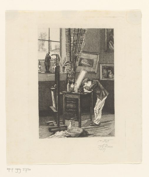
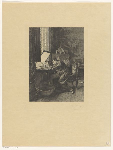
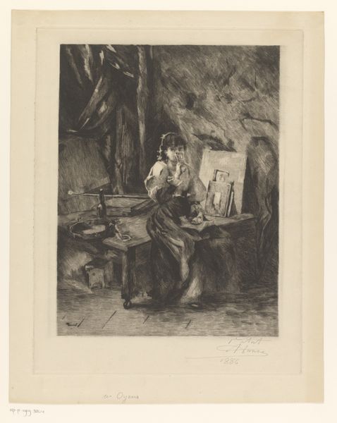
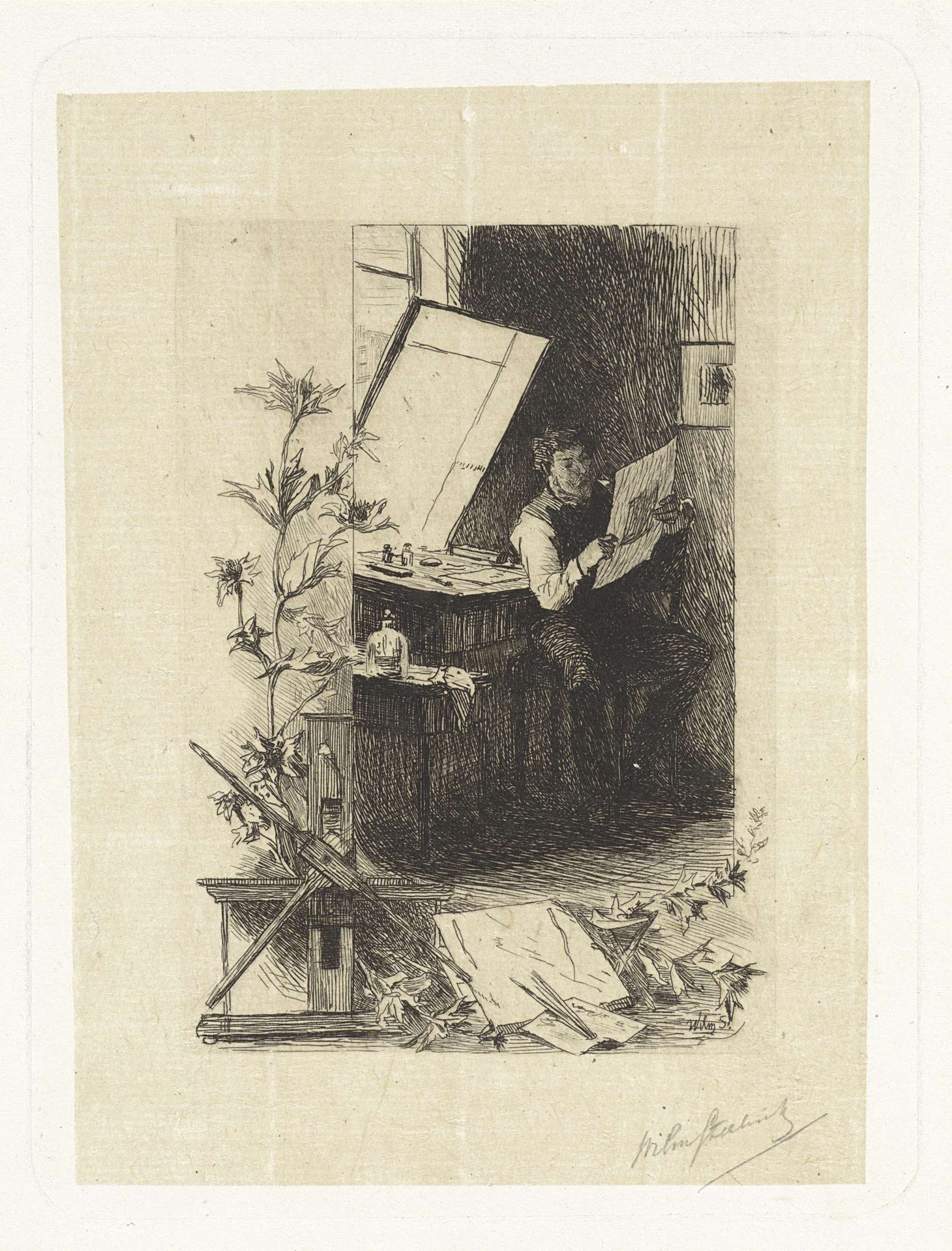
Editor: Here we have Willem Steelink’s "Printmaker in his Studio," an etching made sometime between 1866 and 1886. I find the composition very intriguing. It's almost like two separate scenes coexisting. What do you see in the work's formal construction? Curator: Note how Steelink masterfully manipulates light and shadow through intricate linework. Observe how the central figure, bathed in a soft glow, commands our attention, while the surrounding elements recede into the background through darker tones. The textures too are striking: from the crispness of the paper to the softness of the artist's clothing, all contribute to the tactile qualities of the print. Can you identify how the artist utilizes the formal devices to guide the eye? Editor: The eye definitely travels from the figure to the drawing and around the canvas to the easel, perhaps? The textures almost feel as though the artist is in transition with these rigid dark shapes versus more lively additions of greenery around the corner. Curator: Precisely. The contrast creates a visual rhythm that animates the whole composition. Moreover, there's the relationship between positive and negative space to consider, the linear elegance, the tonal range. How do these choices relate to one another? Editor: So, you're saying it is more than just a picture of a printmaker; it's about how all these visual elements play together and against each other to create meaning. It does have so many intriguing textures and light variances that it certainly elevates a simple etching to another plane. Curator: Exactly. Focusing on these artistic tools helps us unravel its rich visual language. A piece's value is inextricably connected to how it uses form, line, tone, space, and texture.
Artwork details
- Medium
- drawing, print, etching
- Dimensions
- height 160 mm, width 120 mm
- Copyright
- Rijks Museum: Open Domain
Tags
Comments
Share your thoughts
About this artwork
Editor: Here we have Willem Steelink’s "Printmaker in his Studio," an etching made sometime between 1866 and 1886. I find the composition very intriguing. It's almost like two separate scenes coexisting. What do you see in the work's formal construction? Curator: Note how Steelink masterfully manipulates light and shadow through intricate linework. Observe how the central figure, bathed in a soft glow, commands our attention, while the surrounding elements recede into the background through darker tones. The textures too are striking: from the crispness of the paper to the softness of the artist's clothing, all contribute to the tactile qualities of the print. Can you identify how the artist utilizes the formal devices to guide the eye? Editor: The eye definitely travels from the figure to the drawing and around the canvas to the easel, perhaps? The textures almost feel as though the artist is in transition with these rigid dark shapes versus more lively additions of greenery around the corner. Curator: Precisely. The contrast creates a visual rhythm that animates the whole composition. Moreover, there's the relationship between positive and negative space to consider, the linear elegance, the tonal range. How do these choices relate to one another? Editor: So, you're saying it is more than just a picture of a printmaker; it's about how all these visual elements play together and against each other to create meaning. It does have so many intriguing textures and light variances that it certainly elevates a simple etching to another plane. Curator: Exactly. Focusing on these artistic tools helps us unravel its rich visual language. A piece's value is inextricably connected to how it uses form, line, tone, space, and texture.
Comments
Share your thoughts