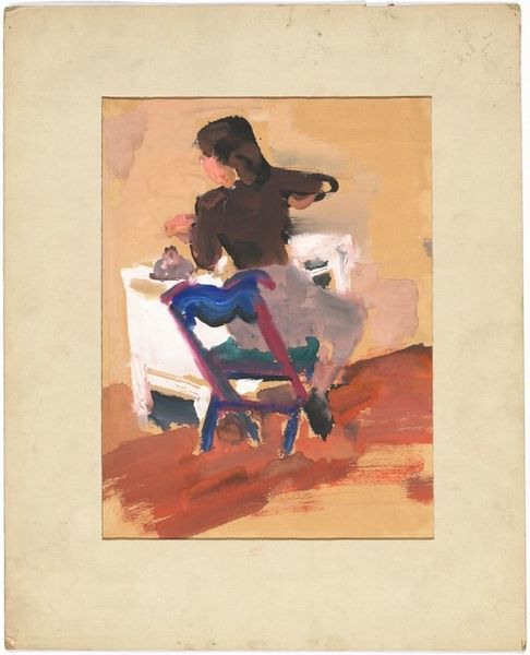
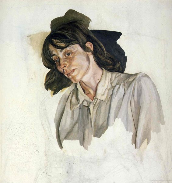
painting, watercolor
#
portrait
#
painting
#
watercolor
#
modernism
#
realism
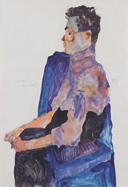
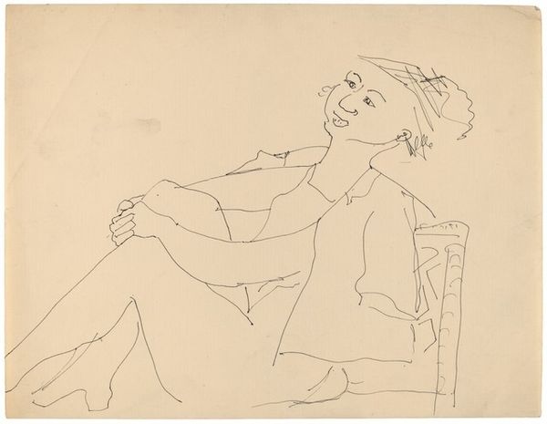
Copyright: Patrick Procktor,Fair Use
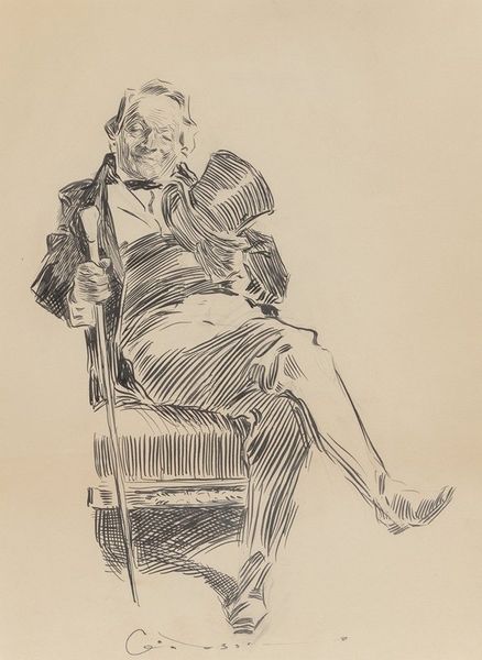
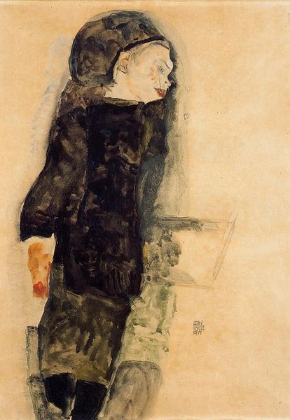
Editor: This is "Dominic Prima" by Patrick Procktor, created in 1981. It's a watercolor painting, and I find the overall effect to be quite serene, despite the subject's rather intense gaze. The artist has chosen a very muted palette. What do you make of the formal qualities of this portrait? Curator: Its beauty resides significantly in Procktor’s calculated simplicity. Note the limited palette, primarily blues and greys. The artist masterfully uses the white of the paper itself to define form and light, reducing the need for excessive shading. The seemingly casual composition, with Dominic off-center and leaning, contributes to a modern feel. The loose brushstrokes give a sense of immediacy. Do you observe how Procktor's line varies in thickness? Editor: I do. In the face, especially, you can see finer lines, giving a real sense of definition and detail. The chair, on the other hand, has much bolder strokes. Curator: Precisely. That variation guides the viewer’s eye and articulates depth. Consider, too, the large negative space around the figure. How does that contribute to the overall impact of the piece? Editor: It feels like it isolates Dominic, creating a sense of quiet introspection. The background isn't competing for attention, which puts all the emphasis on the figure's pose and expression. Curator: Exactly. The formal elements—line, color, space, and composition—work in concert to create a captivating portrait that speaks not of narrative, but of purely aesthetic harmony and structural ingenuity. Editor: I hadn't considered how much the empty space contributed, but I see what you mean now! Thank you. Curator: A close reading of form offers fresh perspectives, every time.
Comments
No comments
Be the first to comment and join the conversation on the ultimate creative platform.
More like this