#
form
#
geometric-abstraction
#
abstraction
#
line
#
modernism
Copyright: Pablo Palazuelo,Fair Use
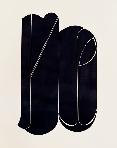
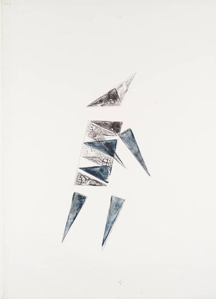
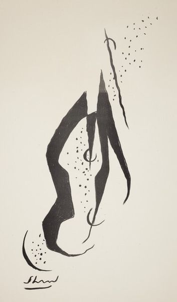
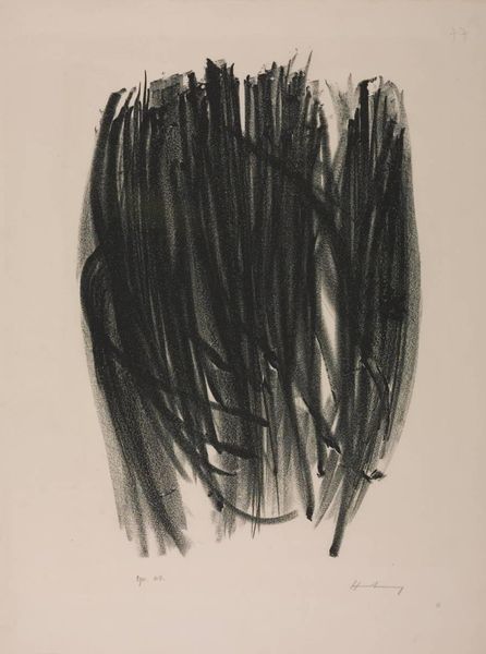
Pablo Palazuelo made this print, Circino XXXVII, sometime in his lifetime, using, it seems, only black ink on a white background. These colours, or lack thereof, are like the foundations for seeing, for building other shades. Look at the shapes here. They are sharp and soft at the same time. Like torn paper, but also like the silky curves of a ribbon. The starkness of the contrasting colours gives a sense of clarity, but the mind can't quite solve the puzzle of the shapes. The pale lines between the black figures provide an optical buzz. The whole image shimmers and vibrates just slightly. Palazuelo's work reminds me a bit of Josef Albers, but with a twist. Both artists were interested in the way that simple shapes and colors can create complex visual experiences. But while Albers was more focused on the precise, mathematical relationships between colors, Palazuelo seems more interested in the intuitive, emotional response to form.
Comments
No comments
Be the first to comment and join the conversation on the ultimate creative platform.
More like this