Dimensions: overall: 60.5 x 45.5 cm (23 13/16 x 17 15/16 in.)
Copyright: National Gallery of Art: CC0 1.0
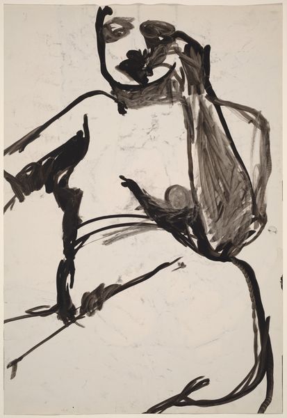
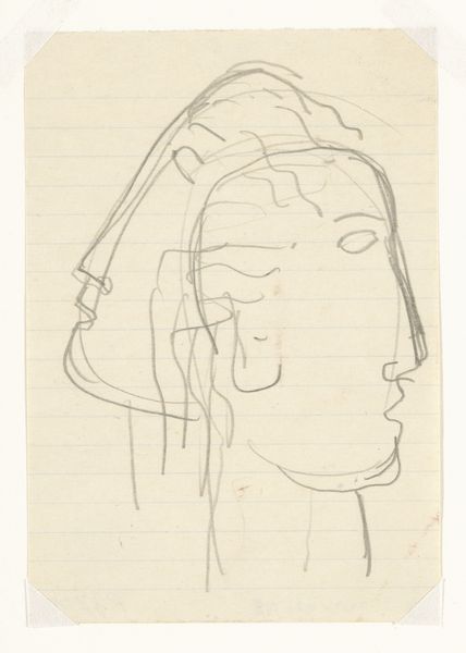
Editor: So, this is Philip Guston's "Head II" from 1969, created with ink on paper. The starkness of the ink against the paper and the rudimentary shapes...it's unsettling, almost childlike in its simplicity, yet deeply disturbing. What compositional elements strike you most forcefully in this piece? Curator: The stark juxtaposition of crude figuration and rudimentary form creates an internal tension. Observe how the contours, rendered in unwavering ink, define a space devoid of conventional perspective. Note the tension generated by the texture variations achieved solely with the use of line and shape. Does this, perhaps, challenge your initial assumptions of simplicity? Editor: Well, yes, because the details do create a tension. The stitched lines on the hood, the unblinking eyes...it disrupts the cartoonish quality I initially perceived. How do those specific shapes influence our reading of the…figure? Curator: The schematic representation, with its focus on essential geometric forms, encourages us to deconstruct the figure into its basic components. The eyes, positioned centrally within the ‘head’, become dominant. The repeated lines forming textures, in turn, create an oppressive visual weight. Do you see how these elements engage in a formal dialogue, pushing us beyond surface-level interpretation? Editor: I think so. It's less about what is depicted and more about how those depictions interact – the weight, the lines, the tension... It's not just a picture, it's a construction. I was so caught up in the image itself that I initially overlooked those elements. Curator: Precisely. Through rigorous visual analysis, we can begin to uncover the complex relationships embedded within the formal structure of the work. By focusing on line, shape, and texture, the work itself becomes a text we can begin to interpret and decode.
Comments
No comments
Be the first to comment and join the conversation on the ultimate creative platform.
More like this