Copyright: Public Domain: Artvee
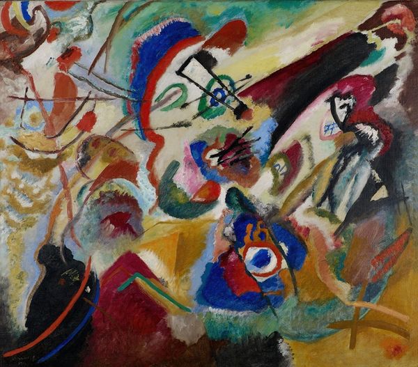
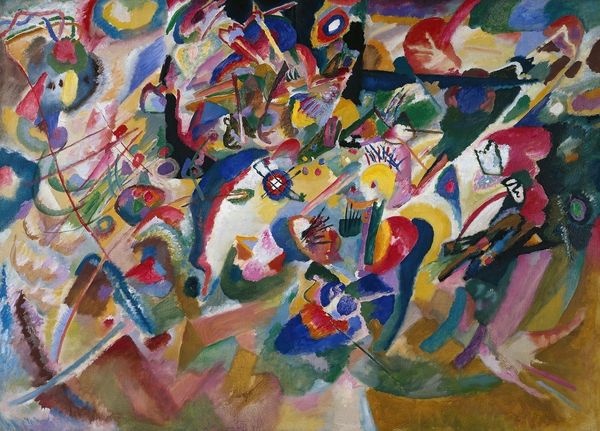
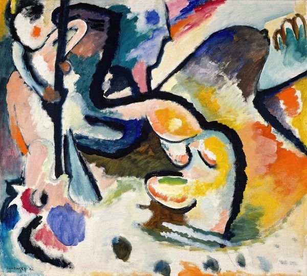
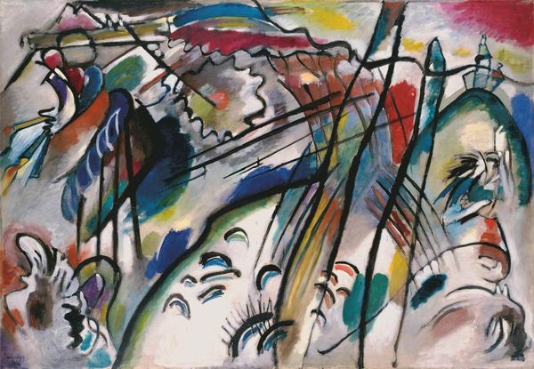
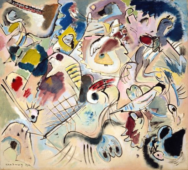
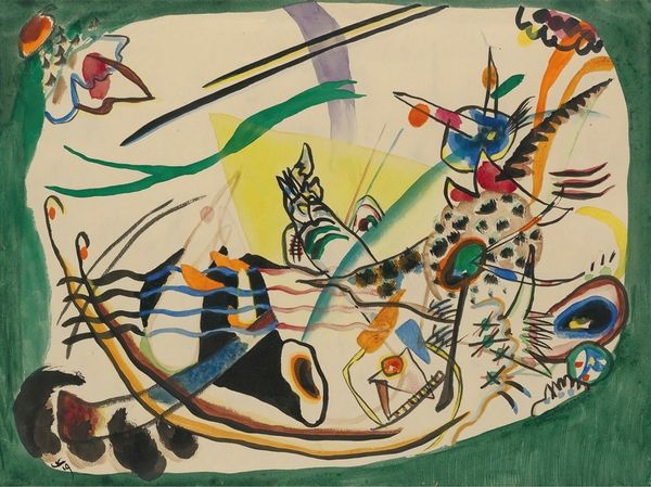
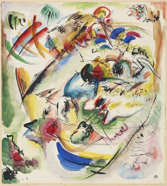
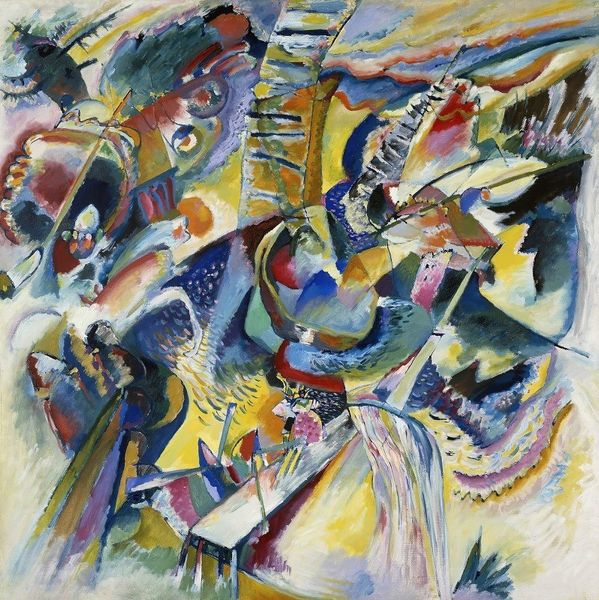
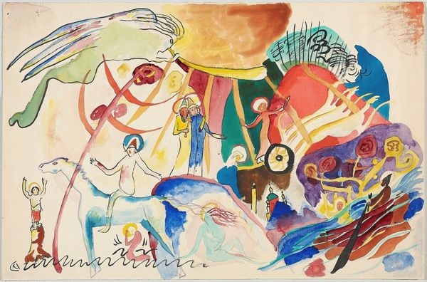
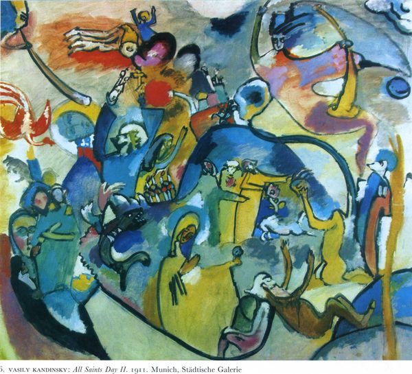
Art Historian: Hello, and welcome. I am here to help you engage more critically with the artwork before us. Editor: Hi! I’m excited to learn more. This is Wassily Kandinsky's "Improvisation No. 30," painted in 1913, using oil on canvas. It strikes me as chaotic yet energetic – almost like looking at a battlefield or some sort of violent struggle. What do you see in this piece purely from a visual perspective? Art Historian: Indeed, chaos seems a suitable description. Focus first on the deployment of color: note the stark contrasts and juxtapositions. How do the colours interact to create spatial relationships and visual hierarchy? Editor: Well, the darker blues and browns seem to anchor certain areas, creating weight, while the brighter yellows and reds jump forward. Is that intentional, creating tension in the eye? Art Historian: Precisely. And consider the use of line. Note how it fragments the visual field and delineate geometric shapes – what sort of structure, or lack thereof, do they evoke? Is it purely decorative, or are they suggestive of something else? Editor: They look deliberately fractured, with broken segments... they seem to almost contain or even imprison certain shapes within their borders! Art Historian: An insightful observation! The fractured lines introduce an element of disharmony and anxiety, yet one also finds harmony within the larger structure. We can thus decode the dialectic conflict using colour, composition and space. Editor: I hadn’t thought of it like that, analyzing each component, as it reveals the intentional chaos... So cool. Thanks so much for shedding light on it! Art Historian: My pleasure. Visual art asks us to look very, very carefully, until we see meaning and order. This structured attention in turn changes how we see the world itself!
Comments
No comments
Be the first to comment and join the conversation on the ultimate creative platform.