drawing, paper, ink
#
drawing
#
dutch-golden-age
#
paper
#
ink
#
intimism
#
calligraphy
Copyright: Rijks Museum: Open Domain
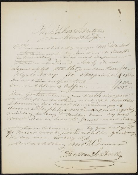
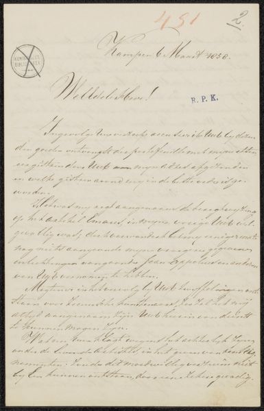
Editor: This is "Brief aan Philip Zilcken," likely from 1893 or 1894. It’s a drawing by an anonymous artist associated with Arti et Amicitiae, done in ink on paper. The handwriting has a really interesting texture, but honestly, it's hard to decipher! What do you see in this piece? Curator: Ignoring, for the moment, the content of the writing, which is inaccessible without translation, let’s consider the graphic qualities. Notice the elegant flourishes, particularly in the salutation. The pressure applied to the pen varies considerably, creating thick and thin strokes. What effect does this contrast achieve? Editor: It gives a real sense of rhythm to the lines. Almost like music on a page. Curator: Precisely. The placement of the text on the page creates an asymmetrical composition. It’s not merely functional writing, but a constructed visual field. Is this composition successful, and if so, by what criteria? Editor: I think so. It avoids feeling stiff or overly formal, which seems fitting for a letter. Curator: Observe the variations in letterform and the idiosyncratic shapes; each aspect adds to the character of the work. Editor: I didn’t notice that level of detail at first, but now I see the unique quality of each stroke and curve. Thanks, I now see beyond the writing. Curator: Indeed, close formal study enables a deeper interaction with the artistic intent and composition of this work.
Comments
No comments
Be the first to comment and join the conversation on the ultimate creative platform.
More like this