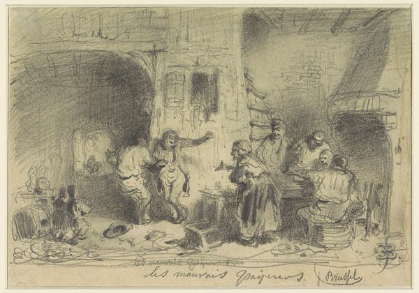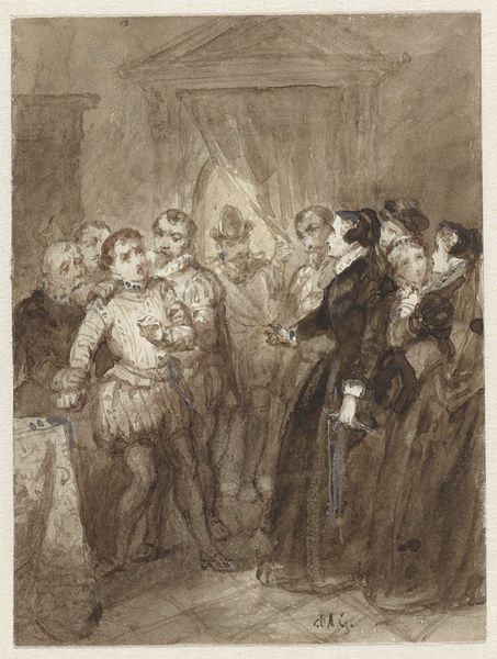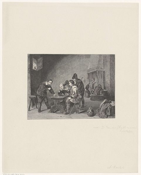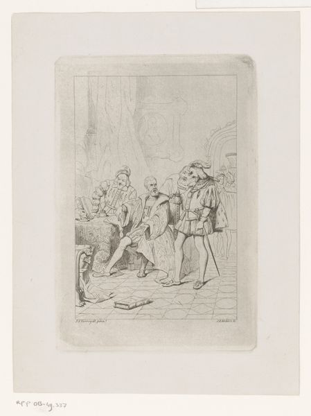
1859 - 1929
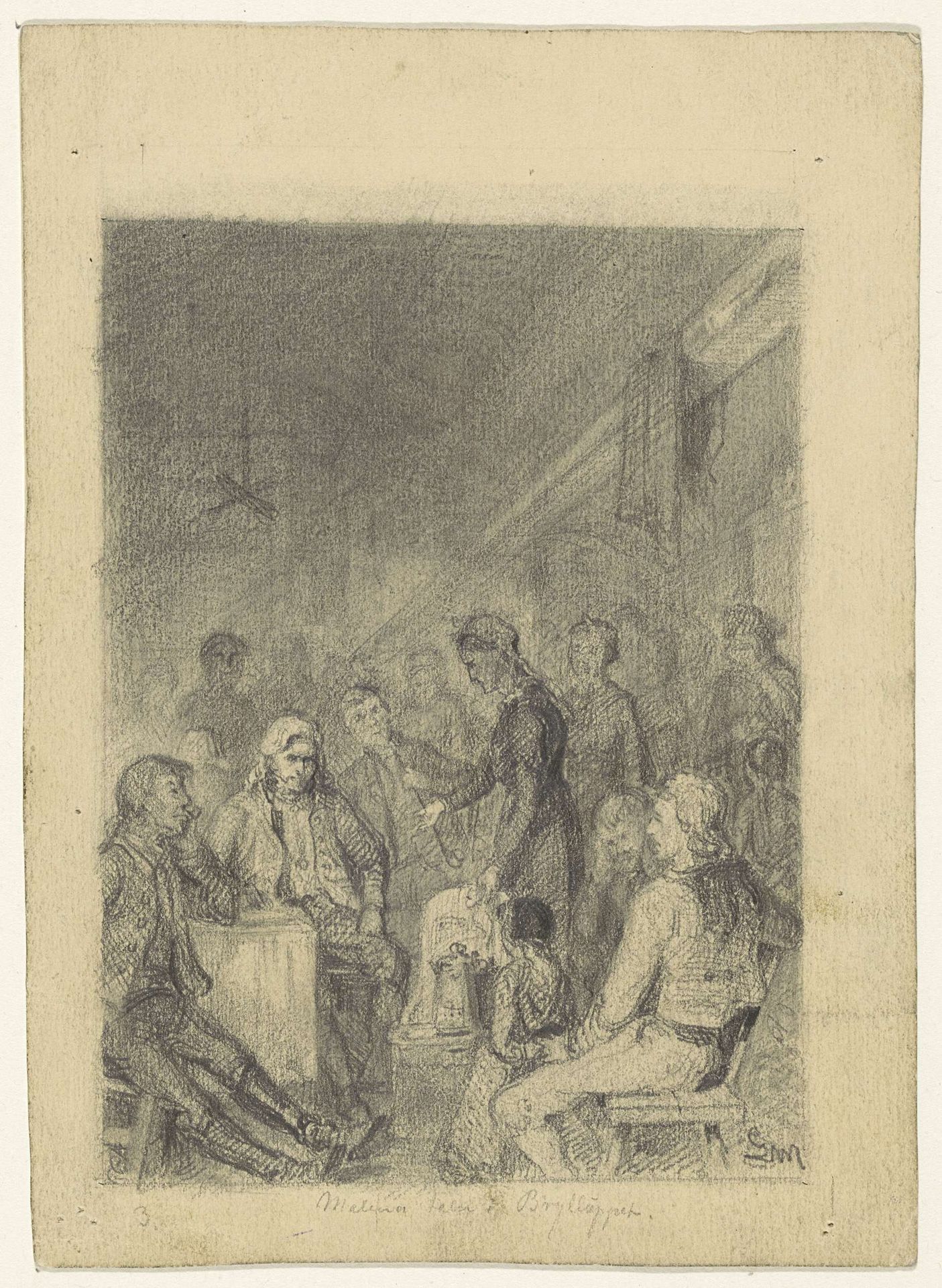
Groot gezelschap waar een vrouw een kan aanwijst
Gerhard Peter Frantz Vilhelm Munthe
1849 - 1929Location
RijksmuseumListen to curator's interpretation
Curatorial notes
Editor: This is "Groot gezelschap waar een vrouw een kan aanwijst" a pencil drawing on paper by Gerhard Peter Frantz Vilhelm Munthe, created sometime between 1859 and 1929. The drawing captures a busy scene. I'm curious about the artist's focus and intention here. What strikes you most about this piece? Curator: Well, from a formalist perspective, the drawing’s strength lies in its skillful manipulation of line and tone to create depth and volume, despite the use of relatively few distinct shades of grey. Notice how the density of pencil strokes varies to suggest both the fall of light and the relative distance of the figures from the viewer. Editor: So it’s not necessarily about *what* is depicted, but *how* it’s depicted. Curator: Precisely. While genre scenes were common, the true subject here seems to be the exploration of form itself. Consider how the figures, though rendered with swift lines, are positioned to form a cohesive pyramidal structure leading the eye toward the center. Do you see that? Editor: Yes, I do. The light source seems ambiguous, adding to that sense of the subjects primarily serving the formal composition. Curator: Indeed. This ambiguity removes a distracting sense of spatial depth. What would you say that the toned paper contributes to this overall effect? Editor: The toned paper provides an immediate middle value. The artist uses lighter and darker pencils to achieve dramatic effects from a sort of unified background. Curator: Exactly! By avoiding a stark white background, Munthe emphasizes tonal relationships and subtle contrasts. It’s less about portraying an actual space and more about investigating form within the limits of pencil and paper. Editor: I never thought about drawings in this way, but considering the arrangement and how light and dark are applied makes the work feel deliberate in its pure artistry. Curator: Analyzing the compositional elements definitely illuminates the work's intentionality.