print, engraving
baroque
pen drawing
dutch-golden-age
pen illustration
pen sketch
ink line art
pen-ink sketch
history-painting
engraving
Dimensions: height 160 mm, width 123 mm
Copyright: Rijks Museum: Open Domain
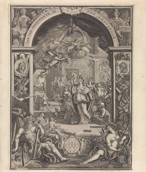
Editor: This is the title page from the "Hollandsche Mercurius" of 1673, created in 1674. It's a print, likely an engraving. It feels incredibly dense, almost chaotic, with figures and text crammed into every corner. How do you interpret this work? Curator: That sense of density is crucial. Consider the historical context: 1673 was a year of intense conflict for the Dutch Republic, part of what's known as the "Rampjaar," or Disaster Year. Visually, we see battles depicted, figures of authority, and symbolic elements crammed together. But let’s also think about what the "Hollandsche Mercurius" actually *was*: a news publication. So, how does the imagery reflect or perhaps shape the narrative it presented to the public during this tumultuous time? Is it objective reporting or something more propagandistic? Editor: Propagandistic, definitely. It seems designed to project strength amidst chaos. There’s Willem III at the top, looking rather regal, despite the turmoil below. The faces in orbs look like they could represent allies and/or key individuals involved in conflicts. Curator: Precisely. And consider how that projection of strength operates. The Dutch Golden Age was a period of immense social and economic stratification. Who was this narrative intended for? Whose interests did it serve to portray Willem III as a powerful leader backed by numerous allies? And who gets left out of the picture, both literally and figuratively? This image is a fascinating example of how art, even in the form of a news title page, can function as a powerful tool for constructing and reinforcing dominant narratives. Editor: So it’s not just a historical document; it's a carefully constructed argument. The composition reinforces specific viewpoints? Curator: Exactly. It's about interrogating whose story is being told and how it benefits them to be framed in that manner. Recognizing those power dynamics embedded within seemingly straightforward imagery? Editor: That gives me a lot to think about! I'll never look at a historical image the same way. Curator: Excellent! Remember, every artistic choice, even in what appears to be a simple title page, can reveal the complex web of power, ideology, and social relations at play.
Comments
No comments
Be the first to comment and join the conversation on the ultimate creative platform.