drawing, ink
#
drawing
#
art-nouveau
#
blue ink drawing
#
bird
#
figuration
#
ink
#
geometric
Dimensions: height 50 mm, width 57 mm
Copyright: Rijks Museum: Open Domain
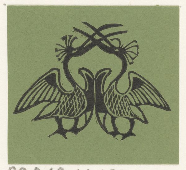
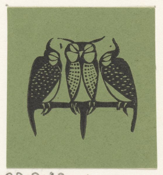
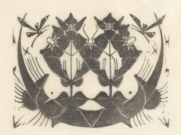
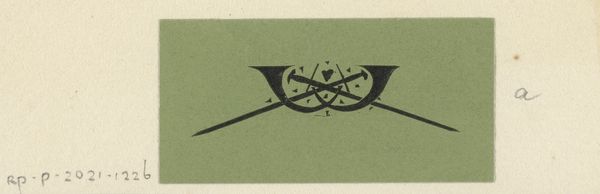
Curator: Looking at this work, "Vignet met vijf flamingo's" by Gerrit Willem Dijsselhof from 1892, I feel like I’ve stumbled into a secret, stylized paradise. Editor: The first thing that strikes me is the formal arrangement. It’s almost heraldic, a tightly constructed emblem. The ink drawing displays an incredible sense of balance. Curator: Precisely! There’s an intense geometry holding all these long necks and quirky flamingo personalities. The symmetry almost makes them feel like they're guarding something… perhaps the secrets to seeing beauty in the everyday. It makes me think of that magical world they evoke, an almost fantastical place. Editor: The flatness is significant. Dijsselhof's style favors a deliberate lack of depth, pushing the flamingos into graphic forms. Notice how the X shape at the base gives way to longer, straighter vertical forms which contrast with the curvature of the flamingos' necks. These linear components and patterns create a very structured aesthetic. Curator: They really play around with form don't they? Like abstracting from a dream, remembering just colours and sensations. It isn't real exactly, but there is an undeniable evocation, a trace, if you like, of feeling in the materials. Editor: Consider the blue ink Dijsselhof employed. A surprising color for these usually vibrantly coloured birds, but it lends the whole piece a somber yet peaceful effect. Also notice the density and application of the ink, used with clear intention to add texture, especially on the birds' heads and wings. Curator: It feels so true somehow... but you can’t pin it down. In essence, that makes Dijsselhof one of the old alchemists I think – able to twist basic pigment and paper to convey some glimmering inner knowing. I suspect it has something to do with the rhythm; those recurring, curved forms are pretty soothing, almost hypnotising. Editor: Absolutely, the repetition adds to the sense of order. Studying Dijsselhof’s use of line and shape helps us understand Art Nouveau's principles. A complete emphasis on stylised decoration to form an intriguing balance between the natural and the abstract. Curator: So, while Dijsselhof may have intended it as an accent to embellish the book, to me it transcends pure illustration and offers us a peek into a symbolic domain all its own. I love how the artist transformed reality into such captivating visual poetry. Editor: Indeed, it is through its stylistic elements, a very precise deployment of ink, geometry, and thematic balance that Dijsselhof's vignette achieves such expressive resonance. A fantastic instance of distilled form meeting vibrant substance.
Comments
No comments
Be the first to comment and join the conversation on the ultimate creative platform.
More like this