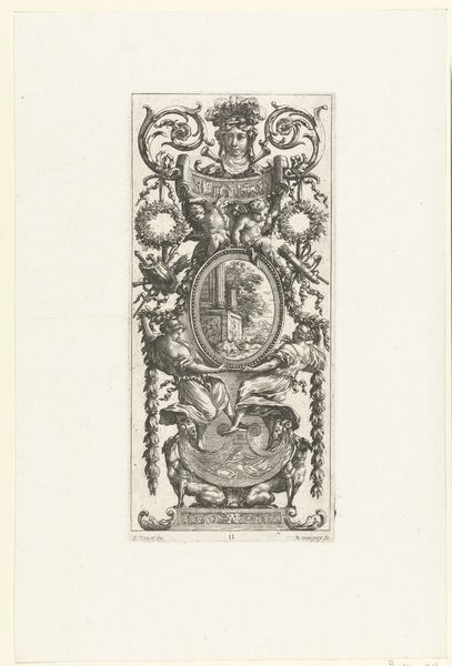
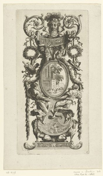
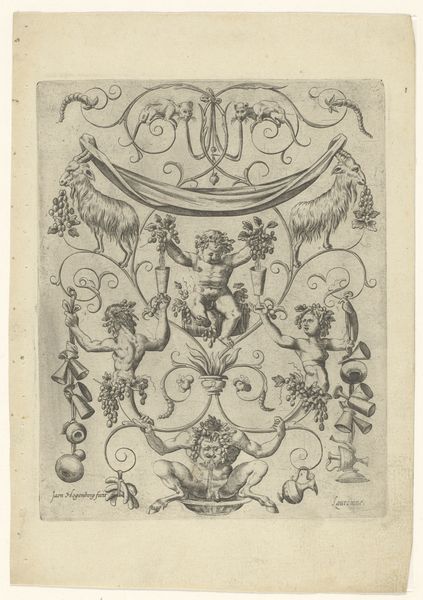
Kramer und Kaufleuth zu Augsburg, Vorlagenzeichnung für ‘Allegorien und Embleme’ 1883
0:00
0:00
drawing, print, paper, ink, engraving
#
drawing
# print
#
paper
#
ink
#
pen-ink sketch
#
engraving
Copyright: Public Domain: Artvee
Editor: Here we have Franz von Stuck's 1883 pen and ink drawing on paper, later printed as an engraving, entitled "Kramer und Kaufleuth zu Augsburg, Vorlagenzeichnung für ‘Allegorien und Embleme’." It has an ordered but strangely asymmetrical quality to it, that I find both intriguing and a bit unsettling. What aspects of its composition stand out to you? Curator: Its formal structure immediately presents itself. Notice the meticulous arrangement of elements within the defined rectangular border. The symmetrical framework, bisected vertically, contains seemingly disparate elements, but note the contrasting weights on either side: a crown versus a money bag. Editor: Yes, the division is clear. How do these opposing images relate to the work’s theme? Curator: The beauty of form lies in the balance, not in perfect mirroring. Observe how Stuck employs shadow and line to create a tension, an imbalance that simultaneously attracts and repels the eye. The crown, with its delicate linework, counters the darker, heavily shaded money bag. Are the numbers `15` and `45` as ornamental, or perhaps are they clues to decoding its symbology? Editor: It's true; without the knowledge to connect the imagery, one must really look at what the artist presents on the surface. Now I want to think more deeply about how light and shadow play into how one views the symbolic objects and how they relate to each other, instead of focusing only on potential historical context. Curator: Indeed. Through its deliberate formal construction, this emblem challenges our notions of symmetry, proportion, and the relationships between seemingly opposing forces and elements. Editor: Well, now I better understand how paying attention to these relationships creates deeper readings. Curator: Absolutely, a rich example of decoding through compositional assessment.
Comments
No comments
Be the first to comment and join the conversation on the ultimate creative platform.
More like this