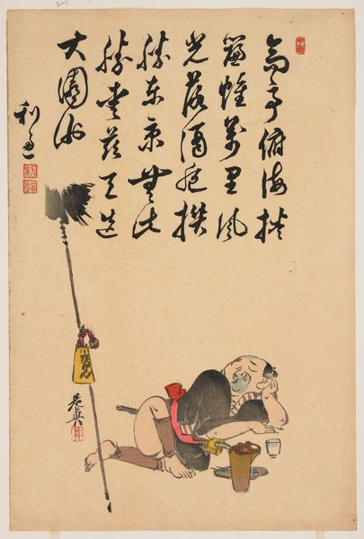
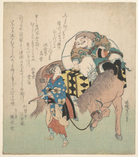
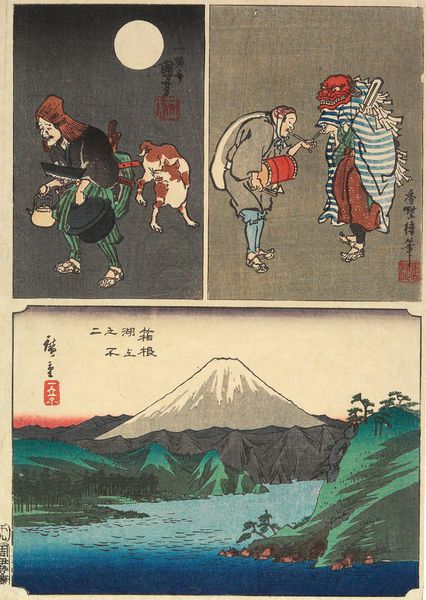
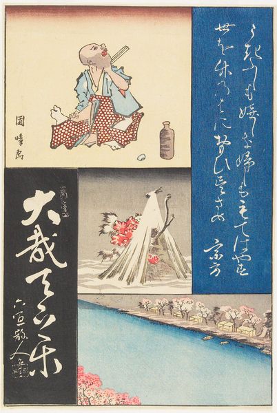
Daikoku God and Chinese Performers with Calligraphy c. early 19th century
0:00
0:00
print, ink, woodblock-print
#
narrative-art
# print
#
asian-art
#
ukiyo-e
#
figuration
#
ink
#
woodblock-print
Dimensions: 15 1/4 x 10 1/2 in. (38.7 x 26.7 cm) (sheet)
Copyright: Public Domain
Editor: Here we have "Daikoku God and Chinese Performers with Calligraphy" created around the early 19th century by Katsushika Taito II and others. It's a woodblock print in ink. The layout is quite striking, almost like a triptych, but asymmetrical. What do you make of the composition here? Curator: Indeed, the asymmetry is immediately arresting. Observe how the artist employs a tripartite division, yet avoids predictable repetition. The figuration on the left, with its dynamic grouping of performers, offers a kinetic energy starkly contrasting with the serene, almost monolithic Daikoku on the right. Note the intentionality behind the color blocking; how does the intense blue field containing the calligraphy function within this visual arrangement? Editor: It seems to almost interrupt the visual flow, pushing Daikoku and his instrument into the background despite being on the rightmost side. The calligraphy becomes another image. Curator: Precisely. We are invited to contemplate the structural relationship between image and text, signifier and signified. Does the presence of calligraphy alter your perception of the depicted scenes, the performers on one side, the deity on the other? The ink, applied with varying degrees of intensity, creates subtle modulations of tone, enriching the visual texture. Do you note the use of negative space? Editor: Yes, the stark white areas around Daikoku really make him stand out despite the light pink background. It seems like there is much attention brought to lines and shapes instead of colors. It makes the picture planes obvious. I am wondering about the relationship between text and image; how would you suggest to decode this piece? Curator: I believe one might read it as a semiotic system, each component—figuration, calligraphy, color—acting as a signifier within a larger network of meaning. The challenge lies in discerning the relationship between these signs and the cultural codes they evoke. It's like we see them almost simultaneously, separated from one another yet existing as an artwork only because they are together. Editor: So, focusing on how the artist manipulates form and composition reveals the deeper symbolic layers within the artwork? Curator: Precisely. And such focused observation enables richer understanding, even if definitive interpretation remains elusive. Editor: It definitely gives me a fresh perspective on approaching ukiyo-e prints, thinking about them in terms of shapes, structures, and semiotics. Thank you for breaking it down.
Comments
No comments
Be the first to comment and join the conversation on the ultimate creative platform.
More like this