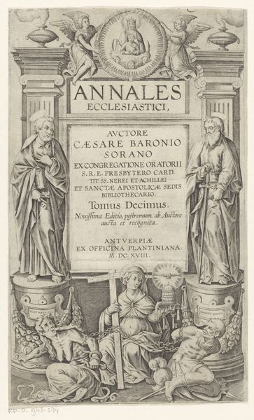
graphic-art, print, typography, engraving
#
graphic-art
#
baroque
# print
#
typography
#
history-painting
#
engraving
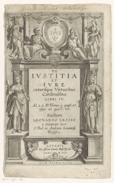
Dimensions: height 90 mm, width 121 mm, height 351 mm, width 230 mm
Copyright: Rijks Museum: Open Domain
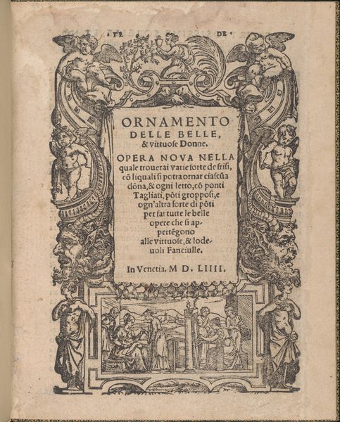
Curator: This is a print from 1698, titled "Minerva and Ceres with an Image of People Working the Land," now held at the Rijksmuseum. It combines engraving and typography. What are your first impressions? Editor: It strikes me as incredibly academic, even before knowing its historical function. The dense text, combined with that idealized, almost dreamlike, depiction of labor feels…detached, somehow. Curator: Yes, that detachment speaks volumes. The engraving would have served as the title page for a scholarly publication, hence the elaborate typography and the somewhat stiff, allegorical representation of Minerva, goddess of wisdom, and Ceres, goddess of agriculture. Notice how they frame a smaller image of laborers. Editor: Exactly. It highlights a hierarchy. We see the "high" ideals of knowledge and prosperity being literally elevated above the actual work and its social reality. The figures are types, almost like illustrations in a textbook, divorced from the material conditions of labor. How would such images impact public perception during its time? Curator: These kinds of images were extremely important in shaping perceptions of labor and the social order. By presenting agriculture as divinely sanctioned and overseen by wisdom, it naturalizes the existing social hierarchy. There is an intention behind the piece that idealizes work. Editor: And what of the choice of the materials themselves, the print medium, typography combined with engraving? What statements are made here about the value of such pieces? Curator: The relatively inexpensive nature of print allowed for a wide distribution of these ideas. It meant concepts—propagandistic or otherwise— could easily disseminate among intellectual and wealthy elites, becoming part of their understanding of the world. The act of creating the book, which involves many different levels of skill is meant for this audience. Editor: I see it as less a window into real agricultural labor and more as a carefully constructed mirror reflecting back a certain image of society onto its elite audience. Curator: I agree completely. It reminds us that even seemingly straightforward images are steeped in the socio-political and economic conditions of their creation. Editor: It's fascinating how a seemingly simple book cover can reveal such a complex web of ideas about work, knowledge, and social power. Thanks for shedding light on it.
Comments
No comments
Be the first to comment and join the conversation on the ultimate creative platform.
More like this