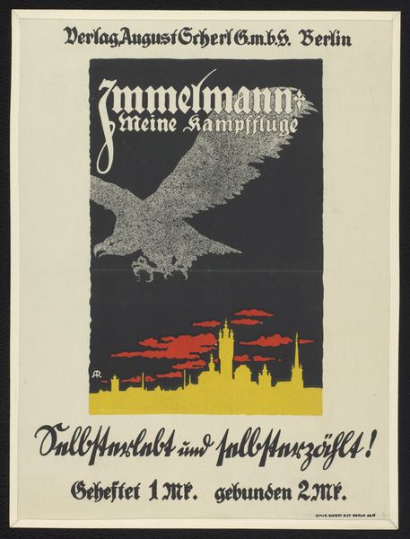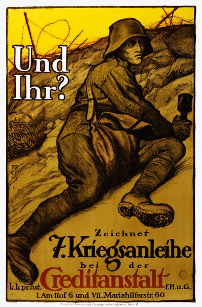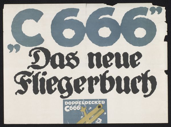
Reclamebiljet voor: Manfred Freiherr von Richthofen, Der rote Kampfflieger, 1917 1917
print, poster
expressionism
poster
Dimensions: height 482 mm, width 230 mm
Copyright: Rijks Museum: Open Domain
This is a poster, a Reclamebiljet, made in 1917 by an anonymous artist, promoting a book called "The Red Battle Flier." Look at that mustard yellow! It's like the color of old paper, but brighter, almost aggressively cheerful, a really strange backdrop for an image of war. The plane is a bright, saturated red, and seems to fall through cartoon clouds. Then there's this smear of dark grey indicating a downed plane in the distance. It’s kind of amazing how they managed to create this strange sense of depth using such flat, graphic elements. The design feels so immediate, like it was dashed off in a hurry, yet there’s a real tension between the quick, almost slapdash execution and the somber subject matter. Think about the context: World War I, propaganda, and the glorification of a war hero. What does it mean to have such a heavy message delivered with such a light touch? It reminds me a bit of the work of Lari Pittman, with its juxtaposition of bright color, graphic imagery, and dark subject matter. Art is always talking to art; it’s a long, ongoing conversation!
Comments
No comments
Be the first to comment and join the conversation on the ultimate creative platform.
