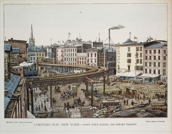
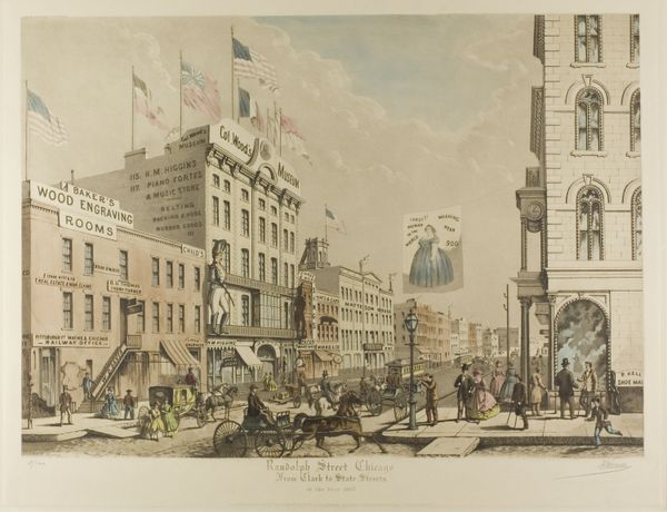
New York and Brooklyn Bridge Entrance 1885 - 1900
drawing, lithograph, print, etching, photography, typography
drawing
lithograph
pictorialism
etching
neo-impressionism
photography
typography
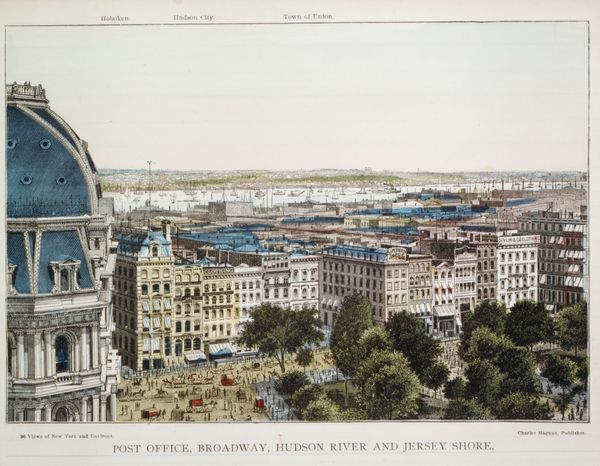
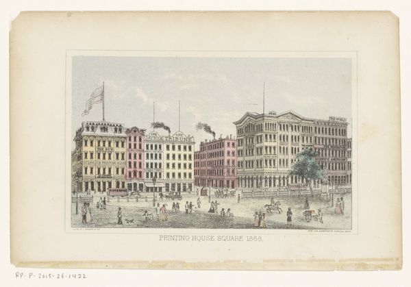
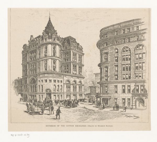
cityscape
Dimensions: 11 x 8 1/2 in. (27.9 x 21.6 cm)
Copyright: Public Domain
Editor: So, this is "New York and Brooklyn Bridge Entrance" by Charles Magnus & Company, dating sometime between 1885 and 1900. It looks like a lithograph, maybe with some etching or drawing involved. There's so much detail crammed in! I'm struck by how bustling the city feels, even in a still image. What stands out to you? Curator: What I see is a very carefully constructed image designed for mass consumption. Consider that this print likely circulated widely, forming and reinforcing particular perceptions of New York. How do you think an image like this, showcasing the "entrance" to the Brooklyn Bridge, contributed to the bridge's symbolic meaning? Editor: That’s interesting... I guess it emphasizes access and progress. It's showing off how modern the city is, with all the transit options visible here - trains, streetcars, pedestrians, horse-drawn carriages. Curator: Exactly. And who do you think had access? The very composition – with the elevated train so prominent – implies certain demographics and erases others. Notice the architecture itself. The "Staatszeitungs Gebäude," a German-language newspaper, is prominently featured. What does this suggest about the city's cultural landscape at the time? Editor: That it was a city of immigrants and diversity, even back then. So this print is like... propaganda for the bridge and for New York as a whole? Curator: In a way, yes. It's a commercial product meant to create a specific image of urban life: ordered, accessible, and booming. It is essential to remember that it represents one view that probably benefitted the makers most. Editor: I hadn’t thought about it that way. Looking closer, you can really see the class divisions just in who's walking where and how they’re dressed. Thanks for pointing that out. Curator: My pleasure. It reminds us that images are rarely neutral; they are actively shaping our understanding of the world, both then and now.
Comments
No comments
Be the first to comment and join the conversation on the ultimate creative platform.