Dimensions: 33.49 x 46.67 cm
Copyright: Josef Albers,Fair Use
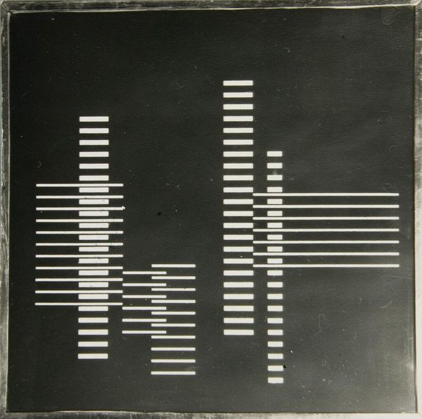
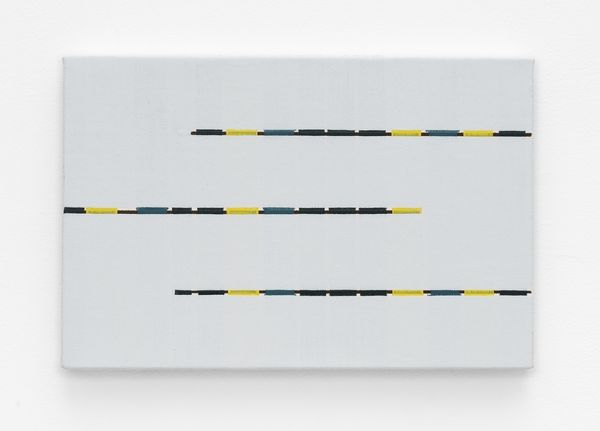
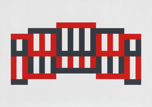
Editor: So this is "Frontal" by Josef Albers, made in 1927, with acrylic paint. The hard lines and simple geometry are really striking; there’s something clean and almost musical about it, like a visual score. What do you see in this piece? Curator: It is fundamentally about the relationship between forms. Note the use of positive and negative space created by the black and white horizontal lines and their interaction with the vertical dashes. Observe the tension achieved by the hard-edged lines contrasted against the softer background. Editor: Tension is a great word for it. Is there a certain element that establishes that for you? Curator: Primarily the composition itself. The work seems balanced and proportional upon first inspection. Yet on sustained viewing, a destabilizing effect occurs. This is due to slight deviations from perfect symmetry, thwarting any sense of stable order we expect. How do these aspects affect your appreciation? Editor: It's like my brain is constantly trying to find a pattern, and just when I think I have it, the pattern shifts! Does the color choice—the flat, orange background—contribute to this destabilizing feeling? Curator: Precisely. The background colour acts as a visual field against which the geometry plays out. Consider how different hues could alter one's perception of spatial depth and overall equilibrium in relation. Albers' masterful use of flat colours emphasizes form above all else, further underlining this concept's importance here. Editor: That's really interesting. I guess I was initially drawn to the colours, but now I see how it's all about the relationships between these formal elements creating that tension. Curator: Exactly. Through careful analysis, we discern these layers contributing meaning beyond simple appearance—something to ponder further indeed!
Comments
No comments
Be the first to comment and join the conversation on the ultimate creative platform.
More like this