print, typography
#
hand written
#
hand-lettering
# print
#
lettering
#
hand drawn type
#
hand lettering
#
typography
#
hand-written
#
hand-drawn typeface
#
stylized text
#
handwritten font
#
small lettering
Dimensions: height 191 mm, width 228 mm
Copyright: Rijks Museum: Open Domain
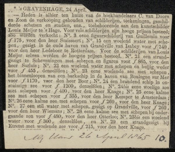
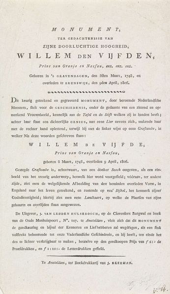
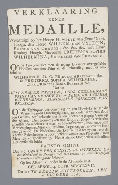
Curator: Well, isn't this striking! Look at the "Begrafenisbriefje van de titels van de prins van Oranje, 1795"—a funeral announcement for the Prince of Orange. Or rather, a send-off to his titles, printed in 1795. A sort of symbolic unburdening. Editor: It does have a performative feel. Immediately I notice the cascade of lettering—how densely packed and varied the fonts are. It’s almost theatrical in its pronouncements, yet tinged with the somber mood you'd expect. A reluctant shedding of grandeur? Curator: Exactly. Pierre Gosse Jr. was the printmaker behind it, during a pivotal moment when the Dutch Republic was under immense pressure. This isn’t just any death notice; it’s a political statement disguised as a farewell. Editor: A political statement... in typography! The layers of titles—Prince of Orange, Stadtholder, Admiral-General—read like a list of lost glories, reflecting a very specific moment in Dutch history. You almost sense the artist lamenting the erosion of power, yes? It's fascinating how text alone becomes a stage for national identity. Curator: The context is crucial. The alliance with France had collapsed, marking the demise of the old order. Gosse presents more than just the titles—it is a history etched in ink. There are more ancient references like "Nero of Gelderland" and "Caligula of Holland," adding extra gravitas... or perhaps irony. Editor: Those historical comparisons... were they intended to critique the deceased ruler, or amplify the perceived loss? Was he truly connecting him to Nero, Caligula? The use of older font styles give the entire announcement a veneer of established legitimacy and historical grandeur, almost like he is mythologizing this loss. Curator: Maybe it’s both? By linking him to infamous rulers, while simultaneously listing all the Prince’s titles, he creates tension. This tension becomes an allegory for the collapsing social structure. Perhaps to critique the ruling family, while simultaneously mourning its absence. This funeral announcement becomes less about death and more about radical social changes. Editor: Right, it's a complex interplay of personal sorrow and public performance. To let it go… but in a really dramatic way! In terms of the impact on the viewer, Gosse creates a space of real complexity that forces us to question political power and how history shapes the present. It’s almost like the man had a stage in his printing studio. Curator: Indeed, and Gosse uses that stage with great eloquence, while giving voice to political unrest, at a truly crucial period. Editor: Thank you for offering us insight into the Prince’s last letter, as it were, I know I leave this viewing understanding so much more!
Comments
No comments
Be the first to comment and join the conversation on the ultimate creative platform.
More like this