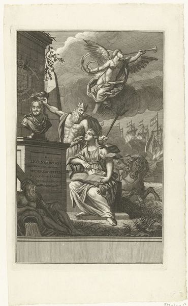
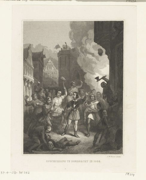
drawing, print, graphite, engraving
#
drawing
#
narrative-art
# print
#
landscape
#
figuration
#
romanticism
#
graphite
#
history-painting
#
graphite
#
engraving
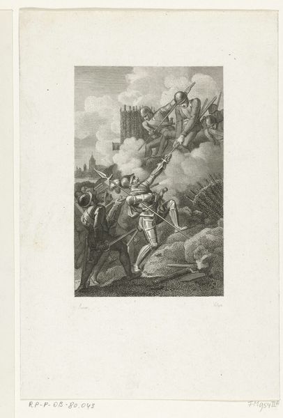
Dimensions: height 238 mm, width 178 mm
Copyright: Rijks Museum: Open Domain
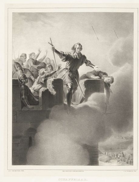
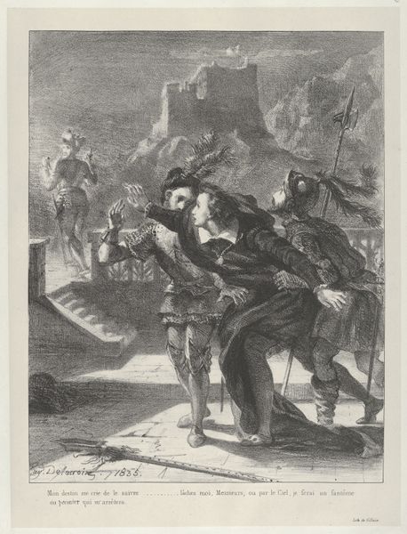
Editor: Here we have Johann Wilhelm Kaiser's print "Jan van Schaffelaar springt van de toren, 1482," created between 1844 and 1846. It’s rendered in graphite and engraving. The dramatic pose of the figure immediately grabs attention, it's a study of bravery. What strikes you when you look at this? Curator: The composition relies heavily on contrasting textures. Observe how the meticulous cross-hatching delineates Jan van Schaffelaar's armour, setting it apart from the atmospheric cloudiness enveloping the tower. Consider the strategic deployment of light and shadow, not merely to describe form, but to amplify the emotional intensity inherent in the narrative. What is your perspective on how scale impacts your viewing experience? Editor: I hadn’t considered it that way. I was focusing more on the Romanticism in the landscape style. There seems to be some attempt to glorify the past or amplify the importance of that single moment, given that his figure looms so largely on the architecture. But now you have me wondering about the use of contrasting texture: perhaps Kaiser uses these different kinds of visual weight to give the piece an emotional gravity? Curator: Precisely. Examine the architecture: it functions not simply as a backdrop, but as an integral element in the symbolic language of the piece. The strong vertical lines and solidity offer a visual counterpoint to Jan van Schaffelaar’s dynamic leap, underscoring the theme of sacrifice against a looming fate. Also, observe that Kaiser contrasts sharply the very finite details of the foreground and how loosely the background crowd is depicted. Does it amplify the single man’s plight? Editor: That is such a striking point, it feels so clear to me now. I see it as all being about perspective: literal perspective and perhaps our own personal views on sacrifice and the weight we give it. It’s almost architectural, the way you frame your insights! Curator: I am just glad that my viewpoint gave you food for thought. Editor: Absolutely. It shifted how I interpret not just the historical context but also the artistic choices that went into building its emotional impact.
Comments
No comments
Be the first to comment and join the conversation on the ultimate creative platform.
More like this