#
portrait reference
#
portrait head and shoulder
#
animal portrait
#
animal drawing portrait
#
portrait drawing
#
facial portrait
#
portrait art
#
fine art portrait
#
celebrity portrait
#
digital portrait
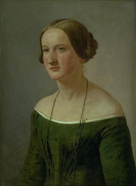
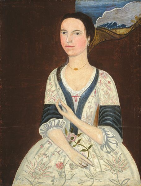
Dimensions: overall: 79.7 x 64.6 cm (31 3/8 x 25 7/16 in.) framed: 94 x 78.4 x 6.4 cm (37 x 30 7/8 x 2 1/2 in.)
Copyright: National Gallery of Art: CC0 1.0
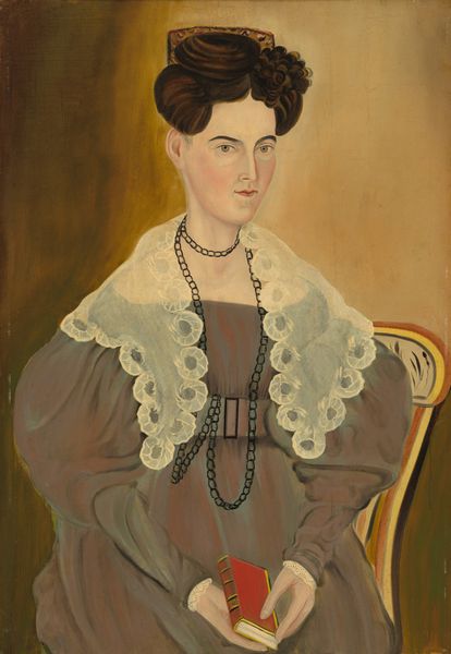
Editor: Here we have "Eliza R. Read," painted in 1833 by Royall Brewster Smith. It’s… striking. The stark green background really makes the figure pop, but something about the rendering of her face feels almost flattened. What’s your take? What do you see? Curator: What immediately strikes me is the artist's treatment of the pictorial plane. Smith eschews deep perspective, favoring a more flattened approach. Notice how the figure seems almost pressed against the green ground. This creates a fascinating tension. And the sharp delineation of forms further contributes to its unique visual quality. How do you perceive the relationship between line and color in this composition? Editor: Well, the lines are certainly bold, aren't they? Especially around her dress and face. It gives her a sort of… cut-out quality, like a paper doll. I guess I see what you mean by tension – it’s like she exists in this space, but not really. Curator: Precisely. And consider the artist's use of light. It's not modeled in a way that suggests roundness or volume. Rather, light is applied in broad, relatively uniform areas, further contributing to the planar effect. How might this flatness, this reduction of three-dimensionality, influence our interpretation of the sitter? Editor: That’s an interesting point. The flatness, combined with the direct gaze, almost feels confrontational. There's an assertiveness that maybe a more traditionally rendered portrait wouldn't have. The artist seems less interested in capturing perfect realism and more in…presenting a clear, unadorned image. Curator: Indeed. Smith’s artistic choices guide us away from sentimental readings, prompting engagement with the pure form and design elements within the painting. Do you find that focusing on the formal elements changes your initial reading? Editor: Absolutely. Initially, I saw it as somewhat naive. But understanding the emphasis on form makes it feel more intentional, more considered. I’m left seeing less of what I thought it lacked in technique and more what it presents in terms of choices about composition and perspective. Curator: Precisely. Through considered attention to form and composition, we can discover new depths, transforming the work from a simple depiction into a richly nuanced artistic statement.
Comments
No comments
Be the first to comment and join the conversation on the ultimate creative platform.
More like this