drawing, pencil
#
drawing
#
dutch-golden-age
#
pen sketch
#
pencil sketch
#
landscape
#
pencil
#
sketchbook drawing
#
realism
Dimensions: height 116 mm, width 162 mm
Copyright: Rijks Museum: Open Domain
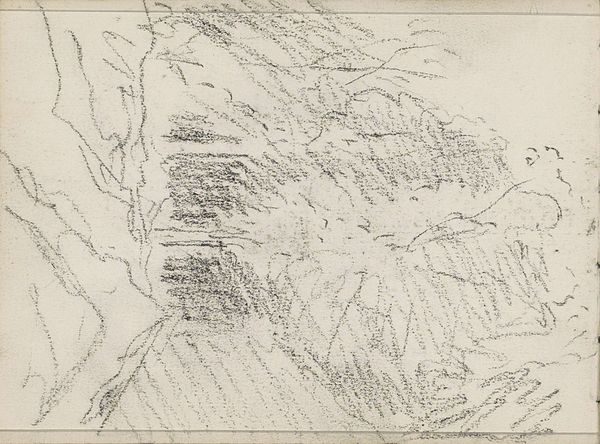
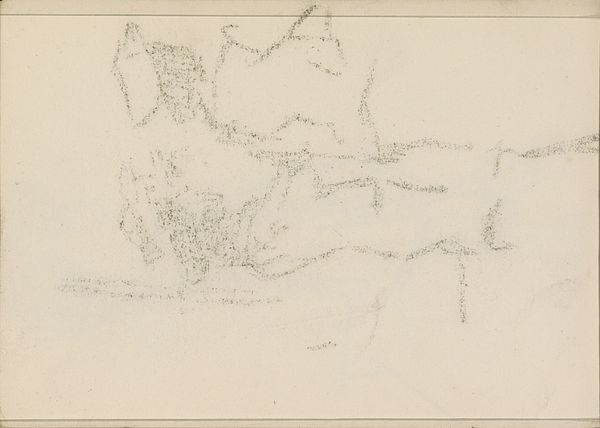
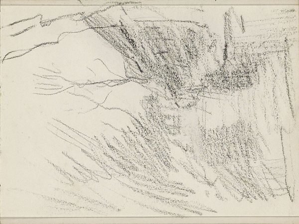
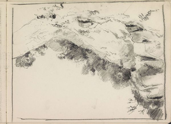
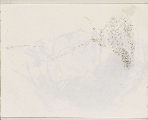
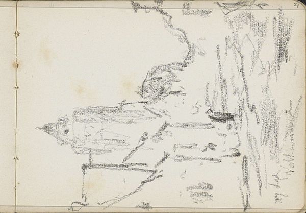
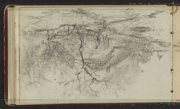
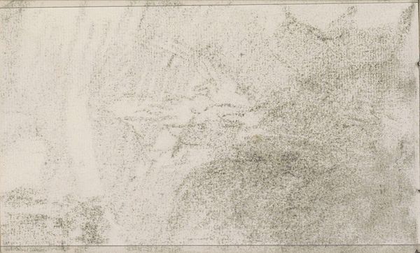
Willem Cornelis Rip made this pencil drawing, Huis bij een molen, on paper sometime around the late 19th or early 20th century. I love the economy of means here. Rip gets so much atmosphere from such a simple set of marks. Look at how he uses smudges and short, energetic lines to suggest the textures of foliage and buildings, almost like a shorthand for seeing. The layered marks create a sense of depth, while the overall sketchiness keeps it feeling immediate and fresh. It's like he's saying, "Here's a place, but it's also just a bunch of lines." For me, the way Rip builds up the dark areas with repeated strokes is really satisfying. It reminds me a little of some of Klimt’s drawings, though Rip's touch is perhaps a bit lighter, more airy. Ultimately, it's that beautiful balance between representation and abstraction that makes this drawing so compelling.
Comments
No comments
Be the first to comment and join the conversation on the ultimate creative platform.
More like this