About this artwork
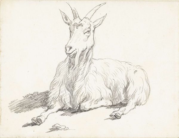
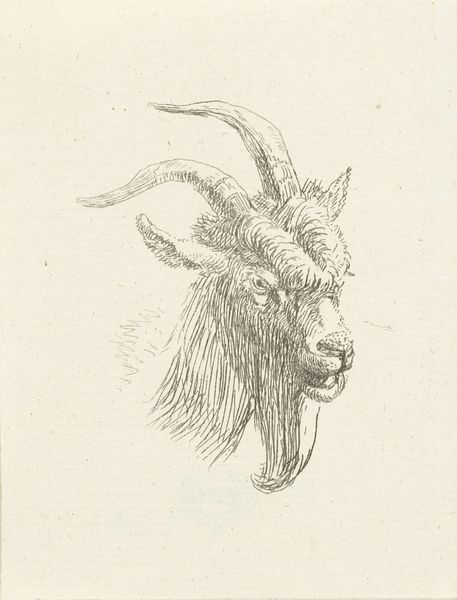
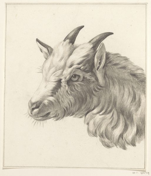
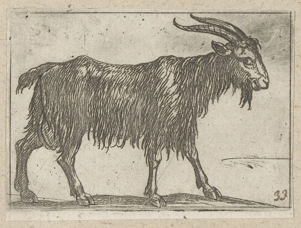
Editor: So, here we have Jan Dasveldt’s “Liggende geit,” or “Reclining Goat,” created sometime between 1780 and 1855. It’s a drawing in ink, and the realism is really striking, it looks almost like a photograph. What do you see in this piece, that I might be missing? Curator: Ah, yes, a somewhat stubborn creature captured in ink. For me, it's about capturing a personality. Look at the gaze – knowing, a little world-weary, perhaps? Think of the long tradition of animal portraiture, often stand-ins for human characteristics. It’s not just *any* goat; it's *this* goat, with its own story. Makes you wonder what it’s seen, doesn't it? And consider the delicate cross-hatching—gives the coat texture and volume despite being just lines on paper. Almost sculptural, wouldn’t you agree? Editor: It does have a very solid feel to it. I hadn’t thought about the personality aspect so much. It is more than just a representation of a goat. I think I was too caught up in the technical skill. Curator: Skill is part of it, of course. But skill serves the story, always. The slight looseness in the lines around the edges keeps it from being overly precious, I think. It’s like the artist wanted to let the goat’s essential “goat-ness” shine through, flaws and all. Editor: That’s a beautiful way to put it. So it's less about perfect rendering and more about... capturing the soul of the goat? Curator: Precisely! Or at least a good go at it. I mean, can we ever truly know a goat? But Dasveldt invites us to try. What do *you* think, after considering this, you goat guru you? Editor: I love it! I see now how the loose lines give it more character. It feels alive. Thanks, I learned a lot. Curator: My pleasure! A new goat convert. Off you go.
Artwork details
- Medium
- drawing, ink
- Dimensions
- height 65 mm, width 89 mm
- Copyright
- Rijks Museum: Open Domain
Tags
portrait
drawing
animal
ink
realism
Comments
Be the first to share your thoughts about this work.
About this artwork
Editor: So, here we have Jan Dasveldt’s “Liggende geit,” or “Reclining Goat,” created sometime between 1780 and 1855. It’s a drawing in ink, and the realism is really striking, it looks almost like a photograph. What do you see in this piece, that I might be missing? Curator: Ah, yes, a somewhat stubborn creature captured in ink. For me, it's about capturing a personality. Look at the gaze – knowing, a little world-weary, perhaps? Think of the long tradition of animal portraiture, often stand-ins for human characteristics. It’s not just *any* goat; it's *this* goat, with its own story. Makes you wonder what it’s seen, doesn't it? And consider the delicate cross-hatching—gives the coat texture and volume despite being just lines on paper. Almost sculptural, wouldn’t you agree? Editor: It does have a very solid feel to it. I hadn’t thought about the personality aspect so much. It is more than just a representation of a goat. I think I was too caught up in the technical skill. Curator: Skill is part of it, of course. But skill serves the story, always. The slight looseness in the lines around the edges keeps it from being overly precious, I think. It’s like the artist wanted to let the goat’s essential “goat-ness” shine through, flaws and all. Editor: That’s a beautiful way to put it. So it's less about perfect rendering and more about... capturing the soul of the goat? Curator: Precisely! Or at least a good go at it. I mean, can we ever truly know a goat? But Dasveldt invites us to try. What do *you* think, after considering this, you goat guru you? Editor: I love it! I see now how the loose lines give it more character. It feels alive. Thanks, I learned a lot. Curator: My pleasure! A new goat convert. Off you go.
Comments
Be the first to share your thoughts about this work.