drawing, paper, ink, pen
#
portrait
#
drawing
#
hand-lettering
#
old engraving style
#
hand drawn type
#
hand lettering
#
paper
#
personal sketchbook
#
ink
#
hand-drawn typeface
#
pen-ink sketch
#
pen work
#
sketchbook drawing
#
pen
#
sketchbook art
#
calligraphy
Copyright: Rijks Museum: Open Domain
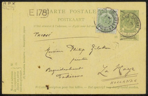
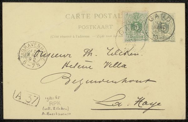
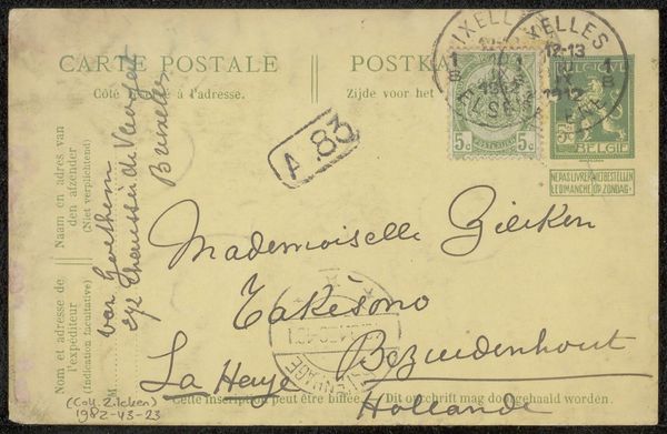
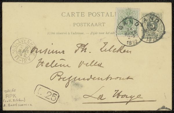
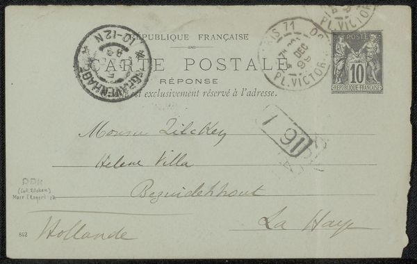
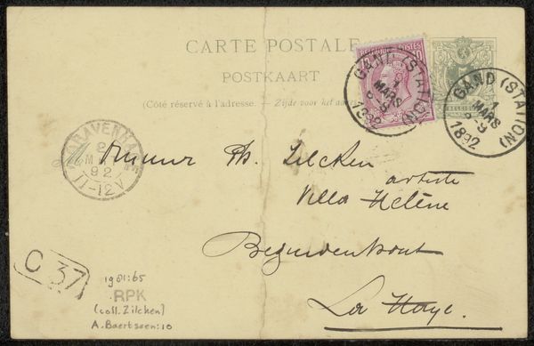
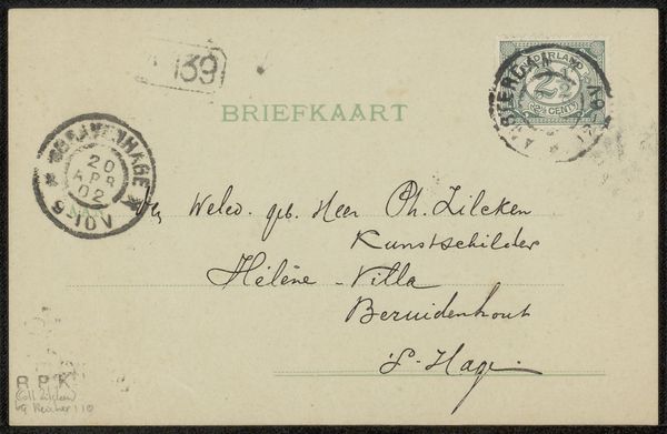
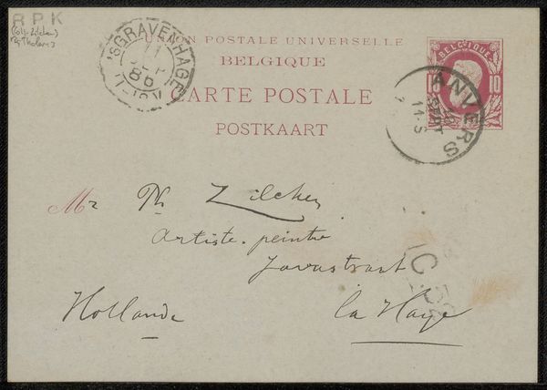
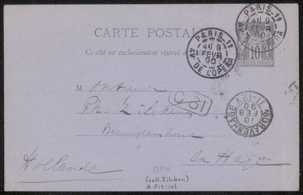
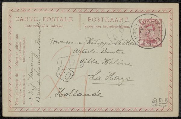
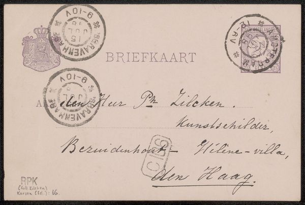
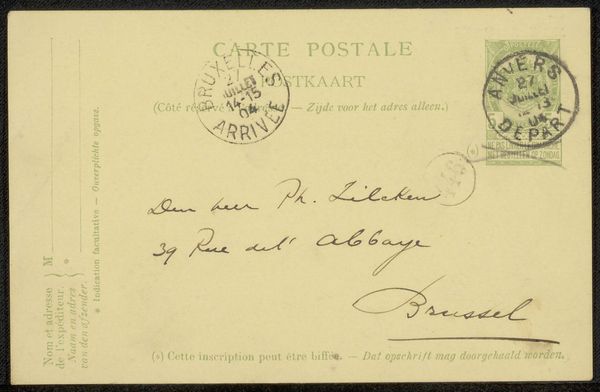
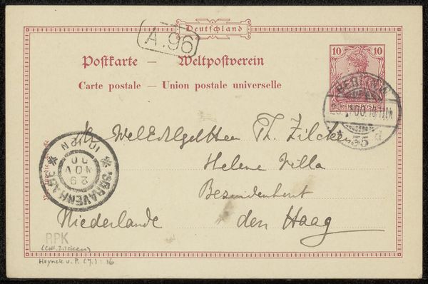
Curator: This is a fascinating find, "Briefkaart aan Jan Gerard Smits" by Cornelis Albertus Johannes Schermer, possibly dating back to 1910-1914. It's an ink drawing on paper, a personal postcard really, showcasing the artist's skill in hand-lettering. Editor: My initial impression is one of faded formality, like uncovering a secret correspondence from a bygone era. The delicate script and muted tones evoke a sense of intimacy and perhaps a hint of longing. Curator: Absolutely. Observe the meticulous craftsmanship in the hand-drawn typeface. Each letter is carefully rendered, contributing to a unified, almost calligraphic aesthetic. The composition directs your eye from the sender's name up to the recipient's address in a dance of forms. Editor: And what strikes me is the social context implied by that formality. The salutation, "Well-born Heer," speaks volumes about the social hierarchies of the time. It's a glimpse into a world where class and status dictated even the simplest of correspondences. Curator: The postal markings, the stamps, and the handwritten address all contribute to the artwork's inherent materiality. These elements function almost like concrete poetry; beyond their literal meaning, they add texture and layers to its overall design. Editor: Indeed. Beyond the aesthetic pleasure of the lettering, the postcard acts as a historical document. It offers a small window into Dutch society and its art circles during the early 20th century. The "Kunstschulden" mentioned alongside the recipient’s name suggests connections to artistic communities of the time. Curator: It's a wonderful interplay of the personal and the presentational, isn’t it? Schermer clearly considered the visual impact of the handwritten text as an art form in itself, imbuing everyday communication with artistic intention. Editor: It highlights the intersections between art, communication, and society. A humble postcard becomes an evocative emblem of its time, imbued with the nuances of interpersonal connection, class consciousness, and artistic expression. Curator: A brilliant synthesis. The power of formal design enmeshed within a historic relic to speak volumes. Editor: A tiny peek into a long gone life.
Comments
No comments
Be the first to comment and join the conversation on the ultimate creative platform.
More like this