drawing, paper, ink, pen
drawing
narrative-art
dutch-golden-age
old engraving style
paper
ink
pen-ink sketch
pen work
pen
cityscape
history-painting
Dimensions: height 205 mm, width 270 mm
Copyright: Rijks Museum: Open Domain
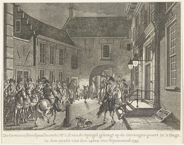
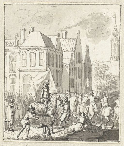
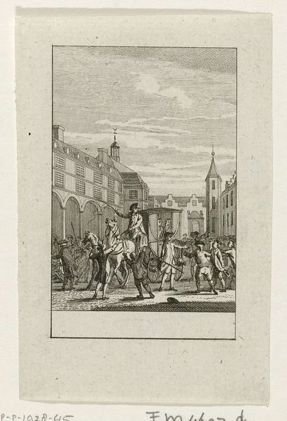
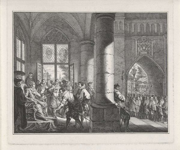
Editor: This is Jan Bulthuis's drawing, "L.P. van de Spiegel naar de Gevangenpoort gebracht, 1795," created in 1796 using pen and ink on paper. It feels very staged, like a theatrical production of a historical event. What structural elements stand out to you in this composition? Curator: Formally, the drawing achieves balance through the strong horizontal lines of the architecture contrasting with the verticality of the figures and the dynamism of the procession. Notice how the artist uses linear perspective, converging towards the arched gate. How does this compositional choice affect your reading of the scene? Editor: It makes the gate the focal point, drawing my eye to the vanishing point. It almost feels like the figures are being led to some unseen fate. The line work is very detailed too. What can we learn from its technique? Curator: Bulthuis’s mastery lies in his varied line work. The pen-and-ink medium allows for a range of textures. Observe the dense hatching creating shadow, contrasted by the delicate, sparse lines defining the figures in the distance. The artist used these formal strategies to create a cohesive and legible narrative. What is your impression of the tonal range in the composition? Editor: It’s interesting you point that out, there are many figures that are hard to resolve which makes the procession fade into the background which makes it difficult to view the individual character of the portrayed. That makes you think. Curator: Precisely. By carefully attending to these compositional elements and artistic choices, the drawing creates a compelling viewing experience beyond just historical documentation. Editor: Yes, now that I see the subtle uses of varied stroke weights it enriches the scene and is definitely more visually engaging. Thanks for your perspective!
Comments
No comments
Be the first to comment and join the conversation on the ultimate creative platform.