Dimensions: image: 740 x 500 mm
Copyright: © Joe Tilson. All Rights Reserved, DACS 2014 | CC-BY-NC-ND 4.0 DEED, Photo: Tate
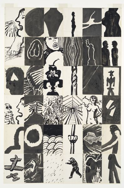
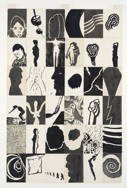
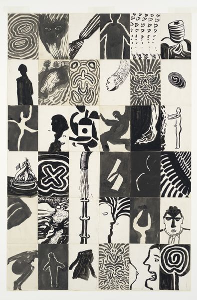
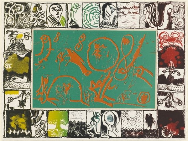
Editor: This is Joe Tilson's "O - Oracle," from an unknown date, held at the Tate. The collection of images feels fragmented, almost like a collage of disparate thoughts. What compositional elements stand out to you? Curator: The grid structure provides a framework, yet the individual panels disrupt any sense of uniformity through their contrasting imagery and textures. Observe how Tilson balances textual elements with graphic ones. How does this interaction affect your perception? Editor: I see a tension between order and chaos. The grid is rigid, but the content within each cell is so varied and unpredictable. Curator: Precisely. The varying color palettes, from muted tones to vibrant hues, contribute to this tension. Note how the artist employs contrasting textures to further complicate the visual experience. The rough grain of some panels juxtaposes the smoother surfaces of others. Is there a focal point for you? Editor: Not really, my eye jumps around a lot. I guess I’m drawn to the brighter panels, like the Eiffel Tower. Curator: That pull is related to Tilson's mastery of contrast, manipulating texture and color to produce a dynamic visual experience. What have you observed about its organization? Editor: I see how the placement of each panel really affects how I read the piece as a whole. Thanks!
More like this