About this artwork
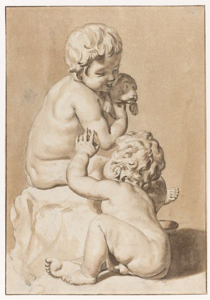
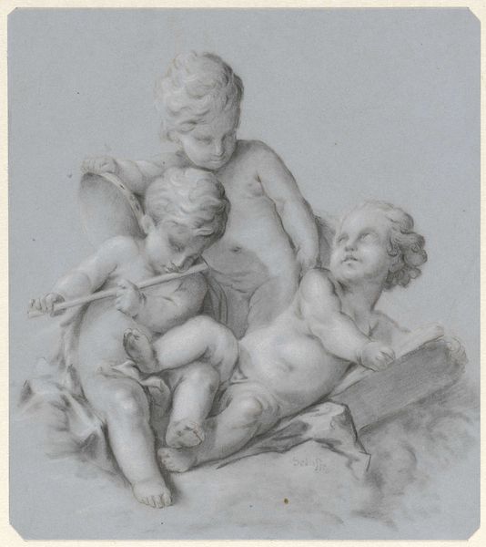
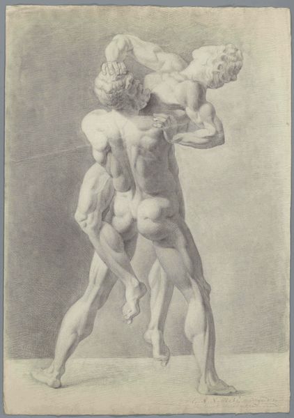
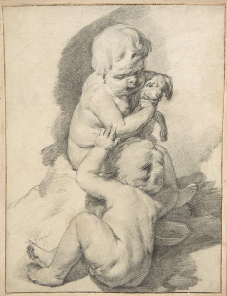
Curator: This graphite and ink drawing is by Jan de Bisschop and is known as "Two Fighting Children." It dates from sometime between 1648 and 1671. Editor: It's surprising how static it feels for such a dynamic subject. Almost sculptural in its careful gradations of tone. The lack of sharp contours makes them feel soft, vulnerable, even amidst the tussle. Curator: The children are modeled after classical sculpture. Childhood skirmishes become emblematic, resonant with art historical precedent, not simply everyday play. It carries an almost allegorical weight. Editor: Yes, the gray wash really enhances that three-dimensional illusion and reinforces this air of weighty importance. Look how skillfully De Bisschop has captured the light as it plays across their bodies, defining their forms. Notice, too, how the composition itself is a kind of pyramidal structure lending stability to what is essentially a chaotic scene. Curator: In terms of symbolism, depictions of children often evoke themes of innocence and purity. Yet here, their confrontation introduces a dimension of conflict, of inherent human drives, however small-scale or comical. Editor: But consider how softened this aggression seems to be. Is that an expression of baroque art generally or do you believe the artist intentionally aimed to emphasize only playful rivalry here rather than something more ominous or charged? Curator: That’s the crux of its enduring appeal, I think. These children capture universal facets of the human condition, reduced to raw essentials, not entirely negative nor without grace. Editor: It's a captivating study of form and emotion. The formal arrangement suggests a posed exercise almost while capturing the spirit and chaos of youth. Curator: Exactly. Through symbolism and technical mastery, de Bisschop has transcended a simple genre scene and imbued it with larger significance. Editor: It's quite beautiful—a testament to the power of line and form to elevate an ordinary moment.
Artwork details
- Medium
- drawing, paper, ink, graphite
- Dimensions
- height 260 mm, width 178 mm
- Location
- Rijksmuseum
- Copyright
- Rijks Museum: Open Domain
Tags
Comments
Share your thoughts
About this artwork
Curator: This graphite and ink drawing is by Jan de Bisschop and is known as "Two Fighting Children." It dates from sometime between 1648 and 1671. Editor: It's surprising how static it feels for such a dynamic subject. Almost sculptural in its careful gradations of tone. The lack of sharp contours makes them feel soft, vulnerable, even amidst the tussle. Curator: The children are modeled after classical sculpture. Childhood skirmishes become emblematic, resonant with art historical precedent, not simply everyday play. It carries an almost allegorical weight. Editor: Yes, the gray wash really enhances that three-dimensional illusion and reinforces this air of weighty importance. Look how skillfully De Bisschop has captured the light as it plays across their bodies, defining their forms. Notice, too, how the composition itself is a kind of pyramidal structure lending stability to what is essentially a chaotic scene. Curator: In terms of symbolism, depictions of children often evoke themes of innocence and purity. Yet here, their confrontation introduces a dimension of conflict, of inherent human drives, however small-scale or comical. Editor: But consider how softened this aggression seems to be. Is that an expression of baroque art generally or do you believe the artist intentionally aimed to emphasize only playful rivalry here rather than something more ominous or charged? Curator: That’s the crux of its enduring appeal, I think. These children capture universal facets of the human condition, reduced to raw essentials, not entirely negative nor without grace. Editor: It's a captivating study of form and emotion. The formal arrangement suggests a posed exercise almost while capturing the spirit and chaos of youth. Curator: Exactly. Through symbolism and technical mastery, de Bisschop has transcended a simple genre scene and imbued it with larger significance. Editor: It's quite beautiful—a testament to the power of line and form to elevate an ordinary moment.
Comments
Share your thoughts