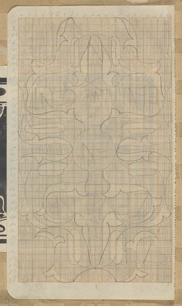
Ontwerp voor een omslag voor een uitgave van Theosophia (jaargang 22, aflevering 1, maart 1914) 1914
0:00
0:00
drawing, graphic-art, paper, typography, ink
#
drawing
#
graphic-art
#
art-nouveau
#
paper
#
form
#
typography
#
ink
#
geometric
#
line
Dimensions: height 248 mm, width 497 mm
Copyright: Rijks Museum: Open Domain
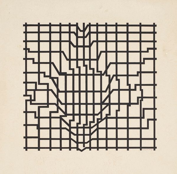
Mathieu Lauweriks designed this cover for an issue of Theosophia in March 1914, using ink on paper. The design feels both ancient and modern at the same time, doesn’t it? I love how Lauweriks uses the grid to create a sense of depth and movement. The lines cascade down the page like a waterfall, each step perfectly measured. It's almost architectural in its precision. Look at the way the word "THEOSOPHIA" is integrated into the design. The letters aren't just words; they're part of the structure itself, morphing into the composition. There’s something very satisfying about the way the ink sits on the paper. You can almost feel the pressure of the pen as it moves across the surface. It reminds me a little of Hilma af Klint's diagrams and charts, how both artists use geometric forms to explore spiritual ideas. It’s a reminder that art is an ongoing conversation, and that ideas can be expressed in so many different ways.
Comments
No comments
Be the first to comment and join the conversation on the ultimate creative platform.
More like this