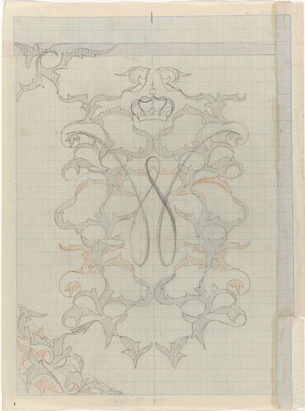
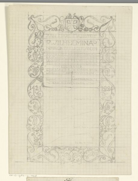
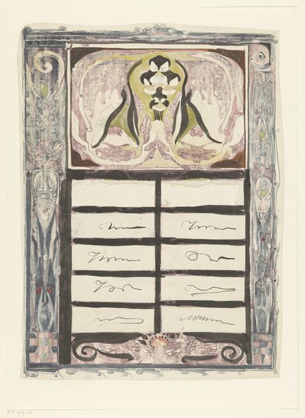
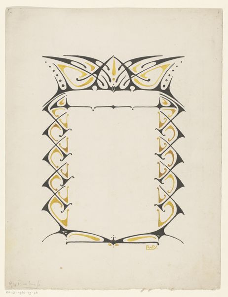
Ontwerp met een gekroonde W en aan weerszijden JB 1874 - 1945
0:00
0:00
careladolphlioncachet
Rijksmuseum
drawing, mixed-media, paper, ink
#
drawing
#
mixed-media
#
art-nouveau
#
paper
#
ink
#
linocut print
Dimensions: height 334 mm, width 250 mm
Copyright: Rijks Museum: Open Domain
Curator: Here we have "Ontwerp met een gekroonde W en aan weerszijden JB," a mixed-media drawing on paper, utilizing ink, by Carel Adolph Lion Cachet, created sometime between 1874 and 1945. What strikes you initially about this work? Editor: Well, my first impression is one of almost heraldic formality, even severity. The starkness of the design, set against the grid of the paper, suggests precision, but there’s a roughness in the execution that I find quite compelling. Curator: Indeed, that interplay between the intended design and the reality of the applied medium is noteworthy. Consider the composition itself; the crowned ‘W,’ flanked by the ‘JB’ initials, are positioned within this ornamented frame. It’s a carefully considered balance of vertical and horizontal elements. Editor: The crown resting on that stylized rose evokes royal power, a rather blunt visual assertion. The ‘W,’ most likely referring to a monarch, dominates the visual field. Is this meant to broadcast authority and legacy? What power does the artist see in symbolism and these kinds of overt emblems? Curator: It’s very tempting to delve into the iconography. What fascinates me more, though, is the technique itself. Cachet uses ink to build up layered effects, creating texture and visual weight with only a relatively simple deployment of hue. There are variations of coloration and ink bleed which speak to a rich awareness of material properties and their relationship to graphic clarity. The use of grid paper suggests a preparatory plan, a mapping-out before committing to a final design, but how rigidly is that planning actually followed in the finished work? Editor: The use of yellowed lettering beneath the initials suggests inscription. Are these family mottos, promises, laws? It creates a kind of official language, further underscoring notions of dynasty, wealth, power and so on. It adds another dimension of historical relevance, I think. This image makes a point about enduring power through signs, a historical power structure crystallized on this design. Curator: Your insights into these visual motifs are quite relevant, I appreciate you noticing the way the lettering further cements the overall impact. This work embodies many aesthetic questions—structure, representation, and how we give meaning to material existence through intentional and deliberate construction. Editor: This artwork, to me, stands as an examination into cultural meanings and lasting cultural continuity.
Comments
No comments
Be the first to comment and join the conversation on the ultimate creative platform.
More like this