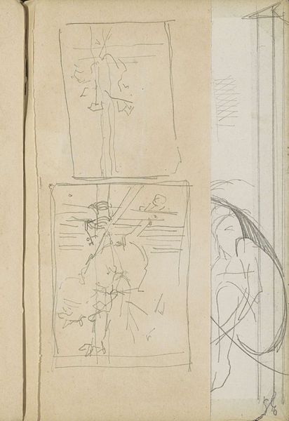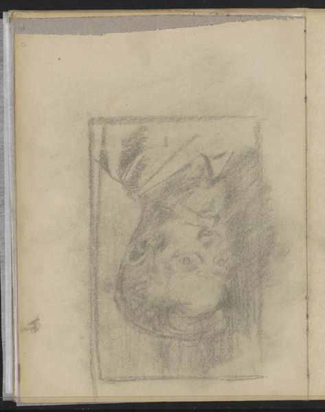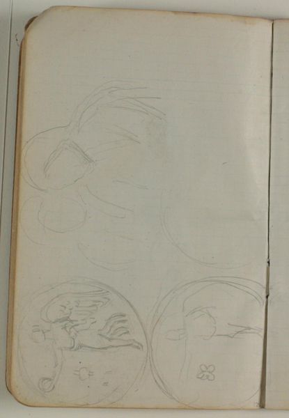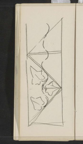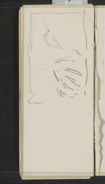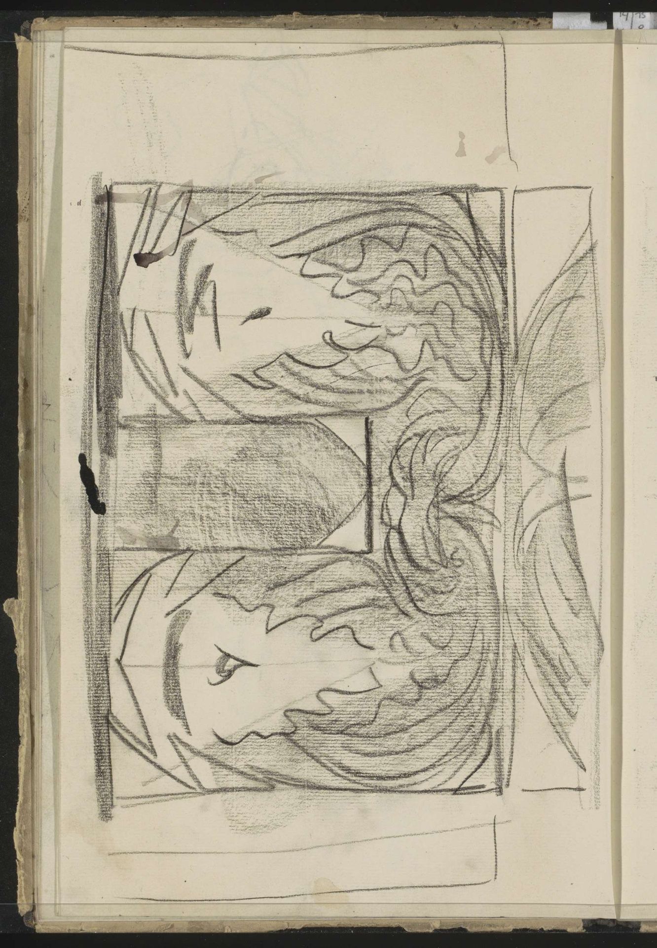
c. 1890
Decoratief motief
Carel Adolph Lion Cachet
1864 - 1945Location
RijksmuseumListen to curator's interpretation
Curatorial notes
Editor: Here we have Carel Adolph Lion Cachet's "Decoratief Motief" from around 1890, a pen and pencil drawing on toned paper. It's quite striking; the mirrored faces give it a strange, almost unsettling symmetry. How would you interpret this work, looking at its formal elements? Curator: Indeed. Observe the rhythmic repetition of lines and forms; the curvilinear shapes of the hair contrast with the geometric framing. The artist’s use of line weight is crucial here. Where lines are dense and dark, the form takes precedence, where they are lighter they almost disappear. How do those fluctuating contrasts of values shape our experience of the depicted heads? Editor: I see that now! The darker lines really define the eyes and jawlines. It’s interesting how the negative space between the figures becomes another shape in itself. Curator: Precisely. The interplay between positive and negative space contributes significantly to the composition's overall dynamism. What then, could we infer about Cachet's approach by the strategic arrangement of geometric shapes and figuration, or perhaps about art nouveau’s predilection toward flattened space? Editor: That makes me consider the Art Nouveau style, the way it tries to bring design elements into fine art. It’s less about depth and realism, more about surface patterns. Curator: Precisely. And it's a surface alive with dynamic tension. Notice that the tonal range and composition lend the drawing its captivating dynamism. Editor: I hadn't thought about the dynamic part as much. It is very alive, the work draws the eye in, it almost hypnotizes you. Thanks, that gave me a totally different way to appreciate Cachet’s motif.