canvas
#
impressionistic
#
abstract expressionism
#
abstract painting
#
generative art
#
possibly oil pastel
#
canvas
#
neo expressionist
#
sculpting
#
abstract nature shot
#
abstract composition
#
expressionist
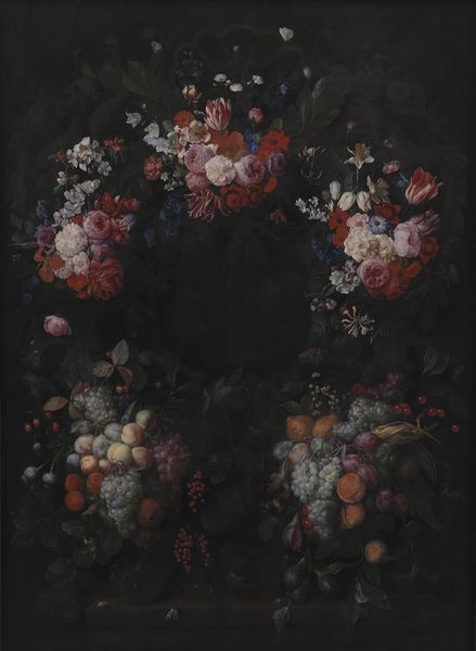
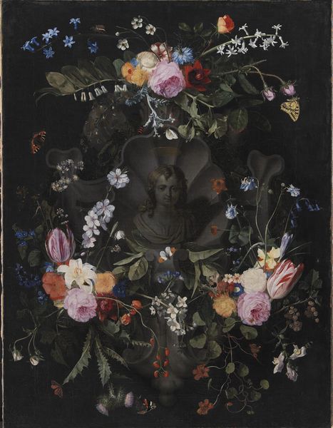
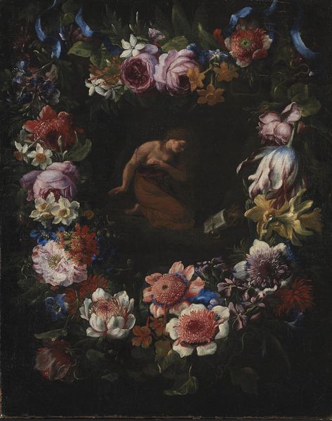
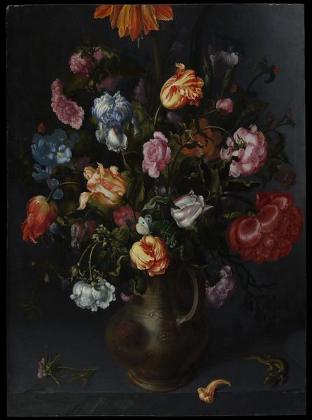
Dimensions: 170 cm (height) x 121 cm (width) (Netto), 191 cm (height) x 141.7 cm (width) x 7.5 cm (depth) (Brutto)
Editor: This is "Stone Cartouche with Fruit and Flower Garland," painted in 1665 by Joris van Son, here at the SMK. The use of color is interesting; it's as if the composition itself is emerging from a background of darkness, focusing your eye. What strikes you most about the composition of this painting? Curator: Formally speaking, observe the stark contrast and visual harmony generated from what we perceive to be light emerging from the gloom; it articulates structure in a painting which appears to teeter on the border of chaos, of abundance perhaps gone awry. Can you perceive how it uses color to create both separation and unity? Editor: I think I do. It's almost a spotlight effect with a range of dark shades on what I imagine to be a stone or dark wall that blends almost into total black. So, what significance can be drawn from his strategic utilization of shadow to isolate his figures? Curator: Indeed, its success lies not just in the individual rendering of the elements, but in how these are united and interact in terms of shape and form. Focus on the circular void in the center—how does this emptiness enhance our experience and understanding of the entire piece? Editor: The circular form provides relief from the business of the many flowers and fruit while lending a sense of order. And what would be there—would there be anything different—if it wasn’t a void? Curator: That absence draws the viewer's gaze into the composition and directs it throughout. How does that affect your viewing experience compared to more modern approaches to depth and perception? Editor: It seems more like a world unto itself, less concerned with external reality. It makes me more attuned to details of what IS there. I see what you mean by visual harmony. I guess there is a good deal to be perceived here that wasn’t as apparent at first. Curator: Precisely. This is an example of how scrutinizing formal properties generates aesthetic significance. I suggest next we look at the texture and balance across the whole artwork, which informs additional, subtle layers of experience and significance.
Comments
No comments
Be the first to comment and join the conversation on the ultimate creative platform.
More like this