graphic-art, print
#
graphic-art
#
cubism
# print
#
linocut print
#
abstraction
Copyright: National Gallery of Art: CC0 1.0
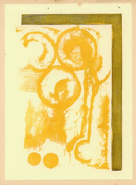
Curator: This compelling work by Georges Braque, dating possibly from 1960, is titled "From 'Le tir à l'arc.'" It's a striking example of his graphic art, specifically a linocut print rendered in shades of blue. What are your initial thoughts? Editor: My first impression is one of calm, almost meditative, movement. The repetition of these ovoid shapes reminds me of ripples in water, or perhaps targets seen through a distorted lens. There's something both calming and subtly unsettling about the abstraction. Curator: Absolutely. These concentric forms do possess a rather primal symbolism. The circle itself is ancient, representing totality, the self, and the eternal. Given the title alluding to archery, might we also consider the symbolic weight of the target? Is Braque suggesting themes of aim, intention, or perhaps even frustration in the pursuit of a goal? Editor: That's a fascinating point, thinking about "the aim" here. In post-war France, the act of aiming might resonate differently – a return to precision and purpose, perhaps, amidst lingering uncertainties. Considering that this is a print, what can it tell us about access to art during that period? Curator: Well, prints made art more accessible. A linocut, though labor-intensive, allowed for multiple reproductions, circulating Braque's vision more widely than a unique painting could. And the use of blue here - evocative of the sky, the sea – carries significant historical weight, associated with royalty, truth, and piety in different eras. Editor: It is interesting that Braque selected linocut as the method, as well. Unlike the preciousness of etching or lithography, the medium brings a kind of democratic sensibility into play. It makes me question the space between high art and everyday experience during that time. How was cubism perceived by the masses then, versus the elite art circles? Curator: That's key – and speaks to how Braque's Cubist language, already familiar, was being renegotiated in the public sphere. While the avant-garde had initially shocked, by the 1960s it was increasingly assimilated into mainstream visual culture, informing design and advertising, changing the very grammar of seeing. Editor: It makes you wonder how Braque himself viewed this transition. His visual vocabulary being subtly absorbed by popular culture… Was he pleased or conflicted? In any case, he truly delivers us a piece with great significance through shapes and context. Curator: Exactly, which just confirms the many layers that continue to draw the viewer in so compellingly. Thanks for pointing out how societal forces contribute to understanding art, it enriches our perspective greatly.
Comments
No comments
Be the first to comment and join the conversation on the ultimate creative platform.
