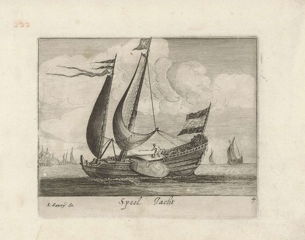
print, engraving
#
dutch-golden-age
# print
#
landscape
#
engraving
Dimensions: height 214 mm, width 164 mm
Copyright: Rijks Museum: Open Domain
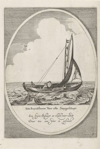
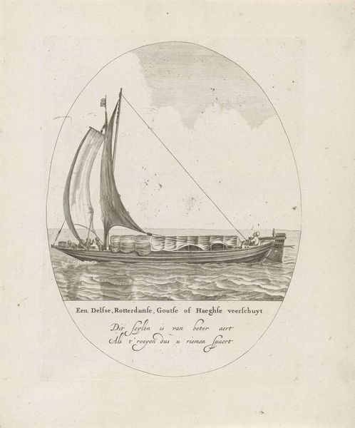
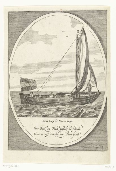
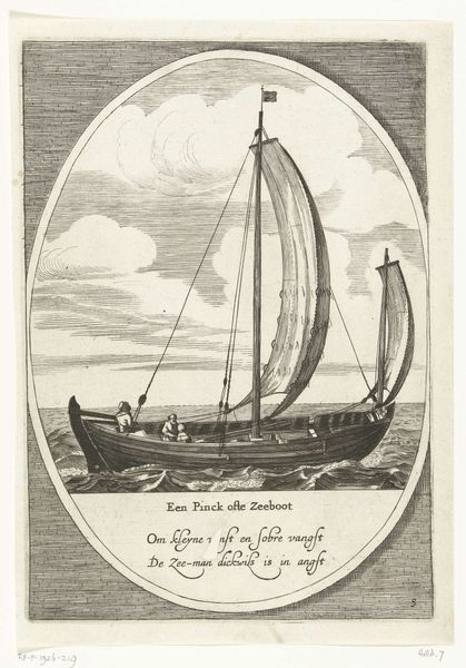
Editor: Here we have an engraving titled "Buiksloterveer of Steigerschuit," created sometime between 1609 and 1686. It's quite a detailed print of a sailboat, contained within an oval. The texture of the water is striking, and there's a calmness despite the choppy waves. How do you interpret the composition? Curator: Observe how the artist manipulates the light. The tonal range is rather limited, focusing primarily on gradations of gray to articulate the forms. The density of the etched lines in the water versus the sky contributes to a distinct visual weight. Consider the implications of containing this maritime scene within an oval; how does this formal constraint shape our viewing experience? Editor: That's interesting! The oval almost feels like looking through a porthole. Do you think the limited tonal range flattens the image, or does the technique still allow for a sense of depth? Curator: It introduces an element of flatness, certainly, by minimizing chiaroscuro. Yet, the linear perspective and the differing densities of the engraved lines suggest recession. Notice how the sail, rendered with relatively spare lines, contrasts with the more densely worked waves. This juxtaposition emphasizes the flatness in the forward visual plane, creating a simultaneous awareness of depth and surface. Editor: I see that contrast now! I hadn't considered how the density of the lines could impact the perception of depth like that. Thanks for pointing out the formal qualities and how they work together. Curator: A close engagement with the formal elements is key to unpacking visual meaning. It is about how lines and shapes interact, in and of themselves, to convey both explicit and subtle nuances.
Comments
No comments
Be the first to comment and join the conversation on the ultimate creative platform.
More like this