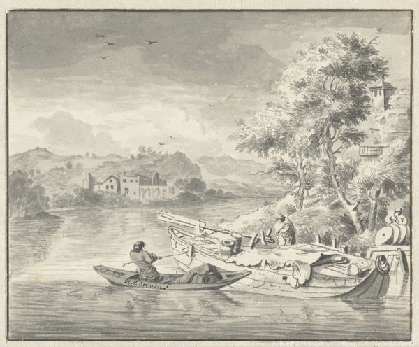
watercolor
#
water colours
#
landscape
#
watercolor
#
coloured pencil
#
orientalism
#
mixed medium
#
realism
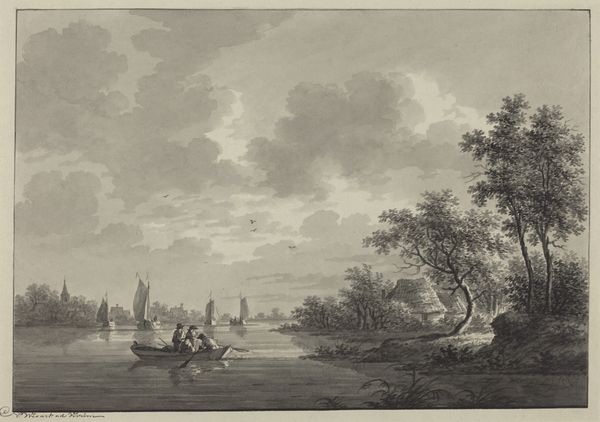
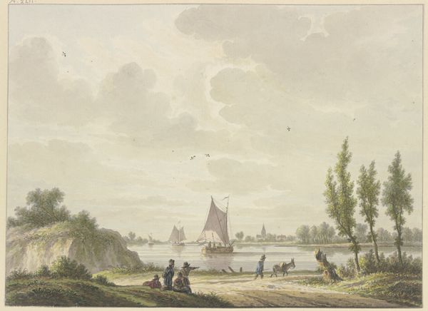
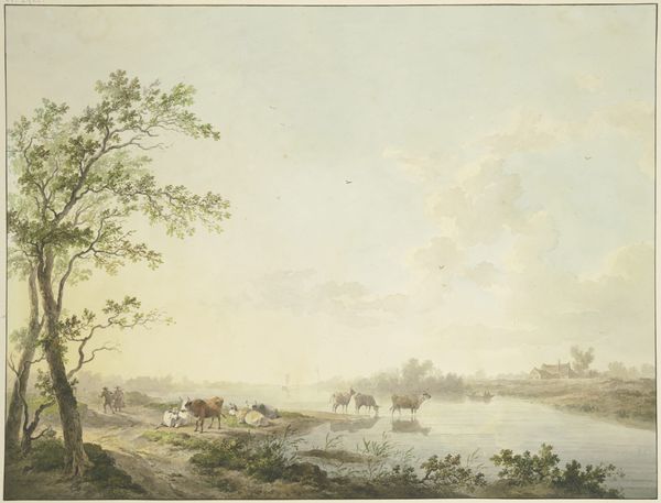
Dimensions: height 265 mm, width 363 mm
Copyright: Rijks Museum: Open Domain
Editor: Here we have Johan Conrad Greive's "Gezicht op rivier de Solo op Java," created in 1869. It’s a watercolor and colored pencil piece currently held at the Rijksmuseum. The first thing that strikes me is the use of light; it feels very still and humid. How do you interpret this work, focusing on its formal elements? Curator: What immediately captures my attention is the formal composition of the painting. Notice how Greive meticulously balances the horizontal expanse of the river with the verticality of the palm trees. Observe how the subdued palette of greens, browns, and blues contributes to a sense of tranquility, but also, perhaps, a sense of flatness overall. The interplay between light and shadow is used sparingly, mostly defining the shapes of the boats and figures on the shore. Do you perceive how these elements work together to construct a particular kind of pictorial space? Editor: Yes, I see how the horizontal lines of the river are contrasted with the verticality of the trees to give the impression of spatial depth, yet I see what you mean by a flatness because it's all on the same plane. It is interesting how light appears in planes too, falling evenly and broadly rather than from any one spot, which diminishes perspective somehow. How much do the boats add, or take away, from that interplay? Curator: The boats, as well as the figures along the shore, serve as crucial compositional elements. They provide a middle ground, acting as a bridge between the foreground and the background. This draws our eye through the picture, using its intrinsic geometries. Greive utilizes repetition effectively, with forms echoing one another to enhance cohesion. Do you think the lack of dynamic contrast contributes to a particular aesthetic effect? Editor: It creates an even tone... I guess it really invites closer looking, because the artistry here is quiet and even all over, versus highlighting just one portion. This encourages us to appreciate all of it and maybe even spend more time to fully comprehend what we are looking at, especially since the subject is probably far removed from our experiences. Curator: Precisely. The uniformity fosters a contemplative viewing experience. By attending to these structural relationships, we arrive at a deeper understanding of how Greive orchestrates visual meaning. Editor: I will never see the planes in light or geometries between forms the same way now. Thanks so much!
Comments
No comments
Be the first to comment and join the conversation on the ultimate creative platform.
More like this