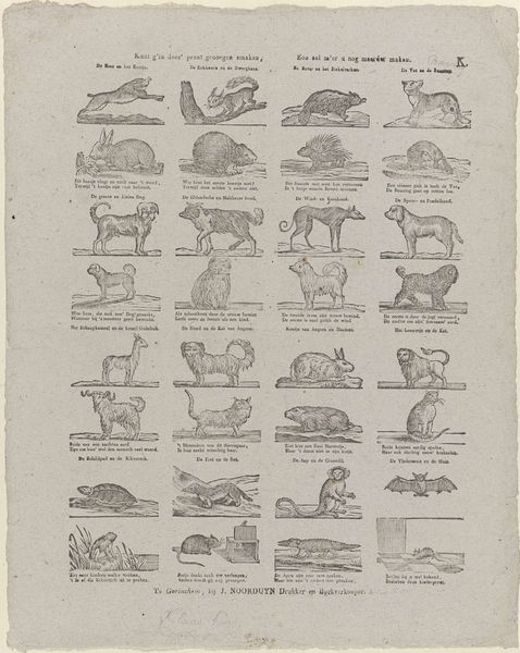
print, etching, engraving
#
medieval
#
animal
# print
#
etching
#
bird
#
engraving
Dimensions: height 420 mm, width 325 mm
Copyright: Rijks Museum: Open Domain
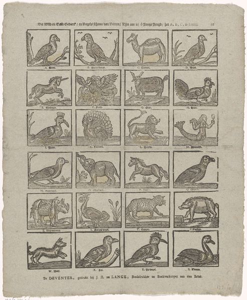
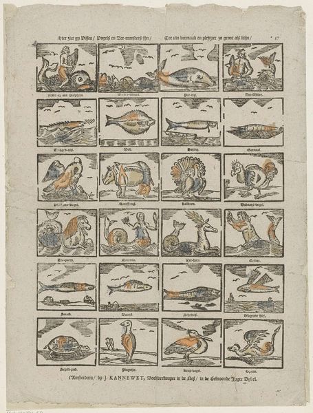
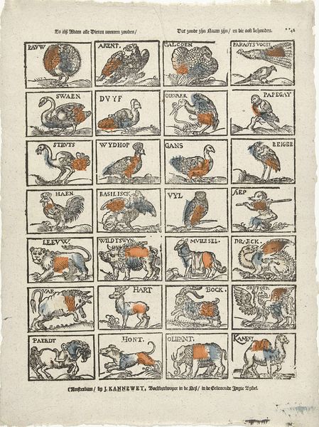
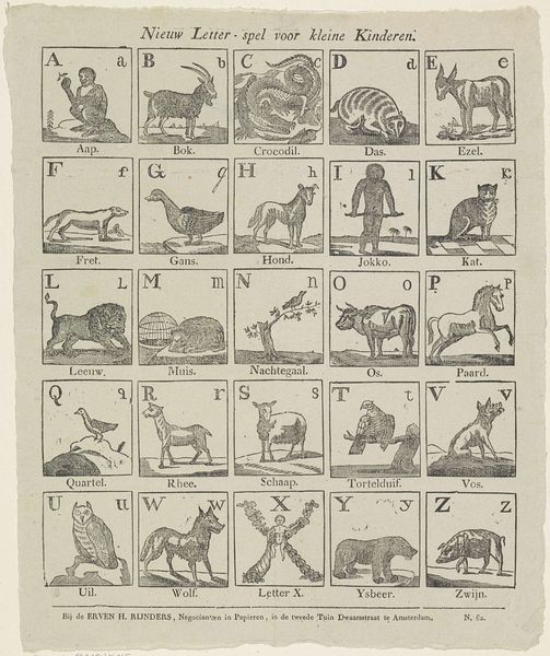
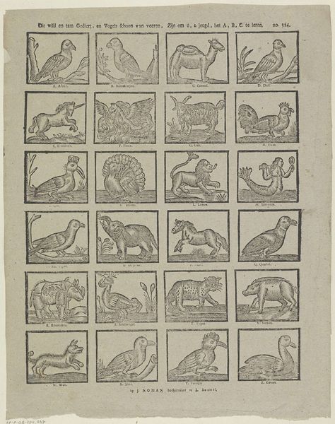
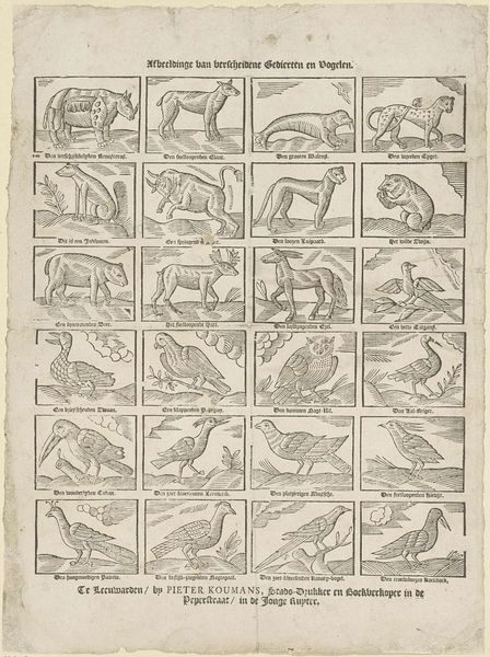
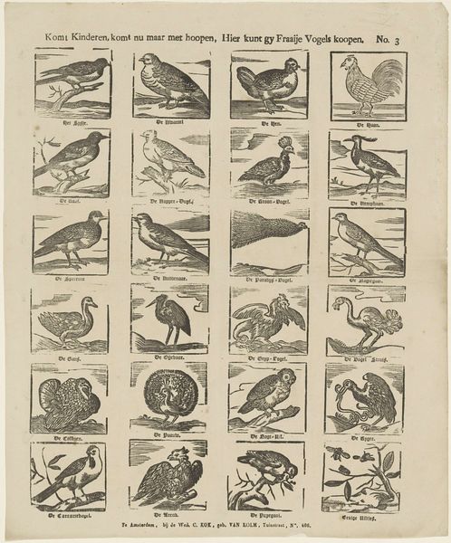
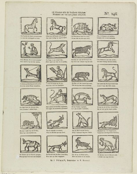
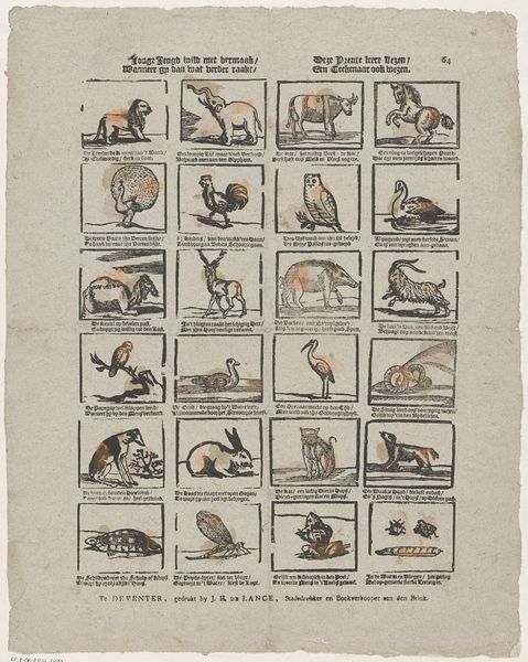
Editor: We’re looking at "Dieren," an etching and engraving print by Johannes Seydel, created sometime between 1776 and 1813. It's arranged as a grid of different animals, and their simple outlines and somewhat crude coloring gives the print an intriguing, almost naive quality. How do you read this work? Curator: Its formal qualities are quite striking. The organization of the animals within a grid immediately establishes a sense of order, a structured taxonomy, if you will. Notice how each animal is rendered with clear, precise lines, emphasizing form over realistic detail. What do you observe about the color palette used? Editor: It’s quite limited, almost rudimentary - just a few washes of color to differentiate the creatures, rather than to achieve any sense of naturalism. Curator: Exactly. The limited color palette further emphasizes the two-dimensional nature of the print. The function is to categorise and distinguish rather than replicate. The flatness of the images, combined with the grid layout, calls attention to the print as an object, a collection of signs arranged according to a specific system. What system do you observe? Editor: Each image has text underneath it, labeling the animal in the frame. Curator: Precise. Language in art functions symbolically. Consider the relationship between the image, its textual description, and your viewing experience. The crude illustration allows you to recognize "a bird," the text then specifies which breed it might be. It’s like an early exercise in semiotics. What does that bring to your understanding of it? Editor: That it may have a didactic purpose - aimed at teaching the viewer about animals. I was only engaging with the image and had missed the opportunity to find meaning in this. Thanks for the insight! Curator: Precisely!
Comments
No comments
Be the first to comment and join the conversation on the ultimate creative platform.
More like this