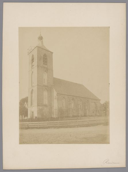
photography, gelatin-silver-print
16_19th-century
photography
coloured pencil
gelatin-silver-print
19th century
cityscape
realism
Dimensions: height 126 mm, width 82 mm
Copyright: Rijks Museum: Open Domain
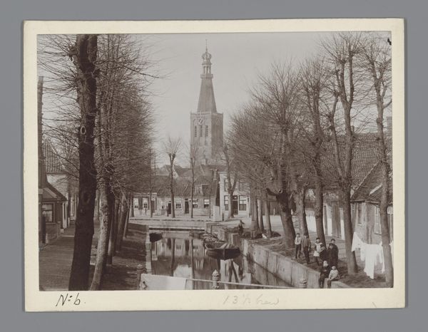
Curator: This is a gelatin-silver print dating from about 1890 to 1900, titled "Rooms-katholieke kerk in Zandvoort," attributed to A. Bakels Sr. It's a view of a Catholic church in a Dutch cityscape. Editor: It's strikingly austere. The limited tonal range amplifies the geometric simplicity of the church against the rather bleak street scene. There's something very rigid and unyielding about its composition. Curator: Interesting, considering the church would have served as a community anchor. I see a built structure relying heavily on skilled craftsmanship from the town it serves: The labour that goes into those tiles, those precise window frames… and of course, the very deliberate photographic printing process. Each one speaks to industry. Editor: Yet the photographic choices negate this celebratory industrial narrative. Note the deliberate, frontal positioning. It creates an impression of imposing stillness. The flatness, achieved through technical manipulation of the print, is almost confrontational. The structure feels almost indifferent to the people in the shot. Curator: Perhaps the artist sought to show the church as an institution amidst a changing social and economic landscape. Gelatin-silver printing democratized image production and consumption—a technology shift! Editor: The visual language transcends such explicit socio-historical reading. I see formal qualities: The subtle gradation in the sky, the echoing triangular pediments of the church and buildings across the street. And observe how that central clock grounds the photograph’s central visual rhetoric in semiotic potential, signifying time passing, control and regulation of the inhabitants. Curator: True, the symmetry offers visual order, reflecting perhaps the desired order of society. Also it looks like hand-applied coloring that was common on black and white prints in that era. Adding value, or perhaps trying to align new mediums to older artistic conventions. Editor: Indeed, the restrained palette supports the overall visual austerity. The light strikes the building directly—emphasizing, but still very matter-of-fact. Curator: Looking at this piece through both our perspectives emphasizes the dialogue between technological progress, artistic intentions, and social context, a relationship that continues to this day. Editor: Precisely, seeing how these elements harmoniously function makes for such rewarding viewing.
Comments
No comments
Be the first to comment and join the conversation on the ultimate creative platform.