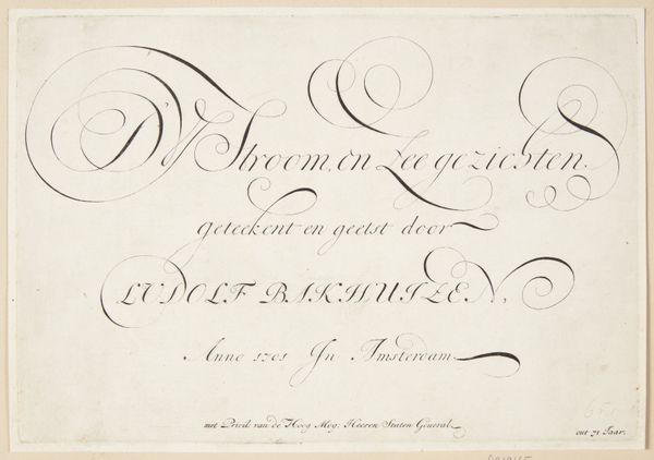
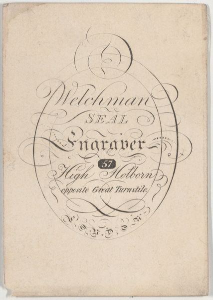
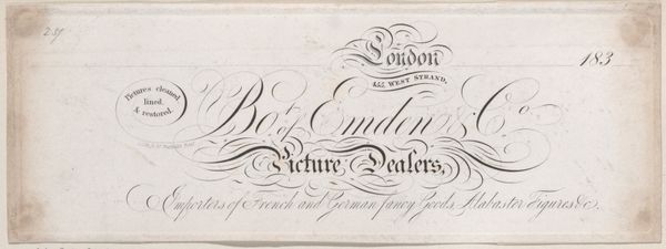
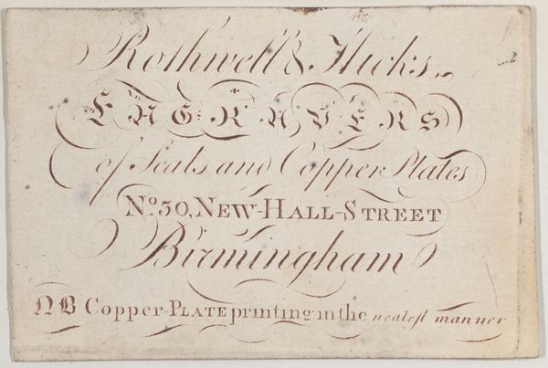
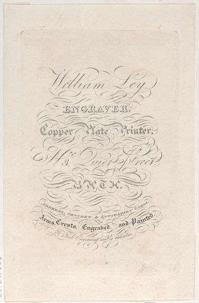
Trade Card for Whitchurch, Engraver & Printer 1800 - 1900
0:00
0:00
drawing, graphic-art, print, etching, typography, poster, engraving
#
drawing
#
graphic-art
# print
#
etching
#
typography
#
poster
#
engraving
#
calligraphy
Dimensions: Sheet: 2 5/16 × 3 1/16 in. (5.9 × 7.7 cm)
Copyright: Public Domain
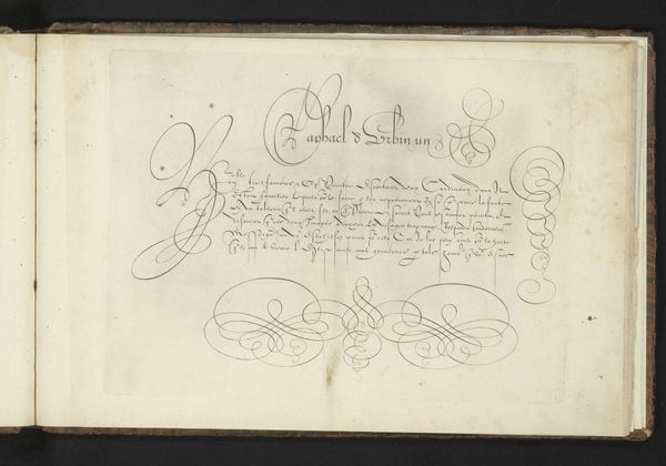
Curator: The elegant script immediately conveys a sense of established professionalism. It’s confident and assured. Editor: Indeed. We’re looking at a trade card—an early form of advertisement—for “Whitchurch, Engraver & Printer,” likely produced sometime between 1800 and 1900. The anonymous artisan has crafted a sophisticated design entirely through typography, etching and engraving. Note the location it serves at "Royal Exchange". This gives it the sense of serving a higher societal position, or class. Curator: Precisely. The composition is superb. The arrangement of the lettering, the flowing lines—it’s a masterclass in visual harmony and typographic rhythm. The eye dances across the surface, led by the curlicues and varying weights of the letterforms. Editor: Beyond aesthetics, these cards served as vital documents reflecting the socio-economic landscape of the time. Who was Whitchurch, and what was his relationship to the Royal Exchange? Was he part of the rising mercantile class, capitalizing on burgeoning trade networks and creating something like branded marketing. And where are those customers now, in our digital landscape. Curator: Perhaps. But consider also the negative space! It’s just as crucial as the printed elements in defining the overall structure. It’s almost like a calligraphic figure-ground relationship, constantly shifting the optical focus between the foreground typography and background canvas. Editor: A more critical approach, then, compels us to examine how such "harmony" might obscure deeper issues. The focus on elegant script deflects from perhaps more dubious practices during that time of increasing British hegemony, such as exploitative labor. Curator: You posit interesting social points, to be sure. But isn’t it valid to appreciate the card solely for its mastery of design and the elegant integration of form and function? To see how typography transforms information into an aesthetic experience? Editor: Of course. But I also feel it’s valid to see that it only shows what the designer intended it to show. Curator: It seems our diverging perspectives provide different, yet valid frameworks, for evaluating such work. Editor: Indeed, that seems like an elegant conclusion.
Comments
No comments
Be the first to comment and join the conversation on the ultimate creative platform.
More like this