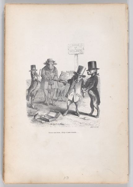
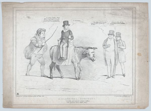
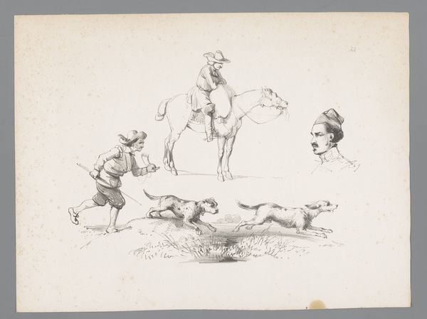
Spotprent met zeven mannen die met een speer een haas aanvallen Possibly 1847
0:00
0:00
johndoyle
Rijksmuseum
drawing, paper, pencil
#
portrait
#
drawing
#
narrative-art
#
caricature
#
pencil sketch
#
figuration
#
paper
#
group-portraits
#
pencil
#
genre-painting
Dimensions: height 300 mm, width 445 mm
Copyright: Rijks Museum: Open Domain
Curator: Let's turn our attention to a pencil drawing that’s rather curious, attributed to John Doyle, possibly created around 1847. It’s called "Spotprent met zeven mannen die met een speer een haas aanvallen" which translates roughly to “Print with seven men attacking a hare with a spear.” Editor: The composition immediately strikes me. Seven figures, rendered with sharp lines, converge towards this tiny hare. The texture of the paper adds a certain starkness that intensifies the scene. It feels intentionally unbalanced and awkward. Curator: That awkwardness is key, I think. Notice the figures – they are caricatures of the elite, top hats and all, attempting a hunt in the most absurdly collaborative and likely incompetent way. The hare, a symbol of vulnerability and innocence, faces overwhelming odds. It reads like a commentary on the disproportionate power structures of the time, doesn’t it? Editor: Absolutely, there's a blatant imbalance represented through line, scale and form. Look how Doyle renders the figures’ clothing versus the simplicity of the hare. It emphasizes not just a social disparity but also a commentary on materialism versus nature, perhaps. The figures’ awkward postures only further solidify that this wasn't supposed to be successful, graceful or admirable, but perhaps it exposes the foolishness of such disproportionate applications of power. Curator: Precisely. Hare symbolism, aside from vulnerability, can also represent cunning, and even resurrection. So is it merely about immediate, overwhelming force, or could the artist be implying resilience and underlying intelligence on the part of the seemingly weak, facing societal attack? Perhaps Doyle is commenting on more than just surface-level inequality? Editor: The limited tonal range of the pencil reinforces a somber quality, wouldn't you agree? Yet that serves as contrast to the comical scene that implies satire, something like pointing a serious stylistic approach at an absurd scenario. The visual restraint highlights the preposterous nature of their actions and hints at the emptiness of their pursuit, doesn’t it? Curator: That makes a lot of sense. Doyle used these visual cues to make the work culturally relevant for years to come. Editor: A deceptively simple artwork, constructed to reveal complicated undercurrents through considered use of formal components, technique and satire. Curator: Agreed. Doyle packed a good bit of societal criticism into what appears at first to be a slightly comical illustration.
Comments
No comments
Be the first to comment and join the conversation on the ultimate creative platform.
More like this