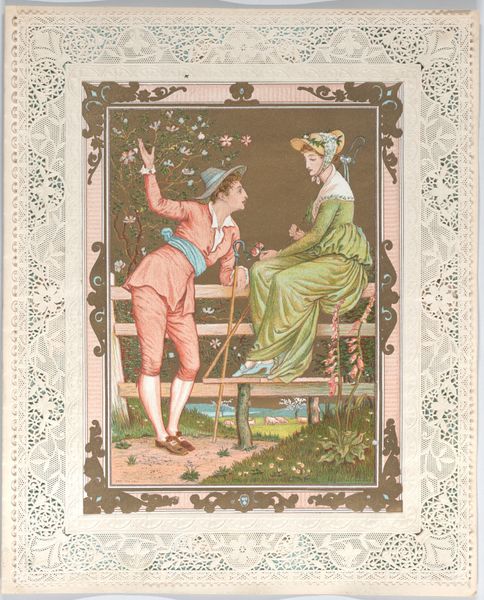
c. 1875
-Taming of the Shrew- tile
Listen to curator's interpretation
Curatorial notes
Curator: This is a ceramic tile depicting a scene from Shakespeare's "Taming of the Shrew," created by John Moyr Smith around 1875. It’s currently housed here at the Minneapolis Institute of Art. Editor: Immediately, I notice the limited color palette. The restrained use of cream, brown, and green draws attention to the crisp, graphic nature of the figures and the geometric border. Curator: Absolutely. These decorative tiles were often produced for middle-class homes, and Smith's designs were very popular. Consider the Victorian-era obsession with narrative; these tiles provided easily digestible stories for domestic spaces. Editor: I see the story. Petruchio's dominant gesture is visually echoed by Katharina's posture; arms crossed defensively as though mirroring him, but clearly resisting. Note how her confinement in the domestic sphere—symbolized by the implied furniture—visually opposes the outdoor adventure typically afforded to male characters in similar narratives. Curator: Good point. The industrial production is fascinating here. Smith didn’t actually manufacture these himself; firms like Minton & Co. were often contracted to produce his tile designs. It’s a commercial transaction impacting the final artifact. The very act of tiling speaks volumes about class and consumerism during the period. Editor: I'm more drawn to how the artist isolates a moment through careful composition. Observe the dynamic triangle formed by the figures and the strategic arrangement of their bodies, using gestures as focal points within the circular frame. The balance struck in this tableau encapsulates tension and anticipation—crucial ingredients of drama. Curator: But doesn’t this aesthetic flattening of the play divorce the original text from its sociopolitical punch? How can you overlook the industrial context for decorative mass production impacting interpretation and consumption in domestic sphere of Victorian England? Editor: The interplay between flatness and depth is what gives the artwork its power. The characters exist in two dimensions, much like figures in a dream. I focus on what's literally here; color and form, rather than symbolic implications or socioeconomic ramifications influencing the reception of such art. Curator: Well, considering both the material and its impact together offers a rich commentary on Victorian-era values surrounding literature and domesticity. It broadens our understanding beyond purely aesthetics or design preferences. Editor: Agreed, but for me, the intrinsic visual qualities hold such potent communicative power. It captures a timeless struggle for dominance—something beyond the historical moment itself.