drawing, paper
#
portrait
#
drawing
#
aged paper
#
script typography
#
hand-lettering
#
hand drawn type
#
hand lettering
#
paper
#
personal sketchbook
#
hand-drawn typeface
#
fading type
#
sketchbook drawing
#
post-impressionism
#
sketchbook art
#
calligraphy
Copyright: Rijks Museum: Open Domain
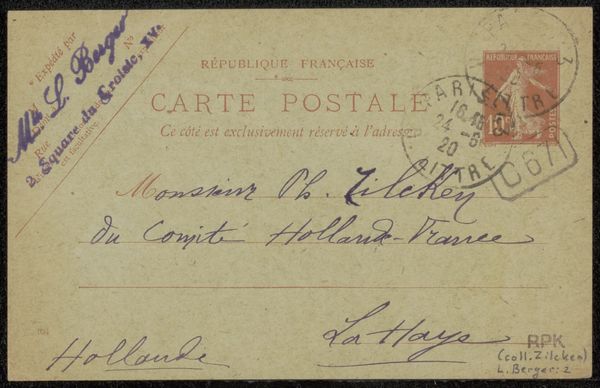
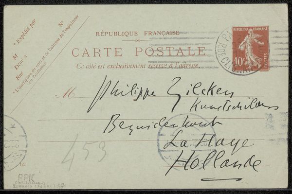
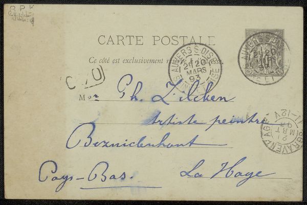
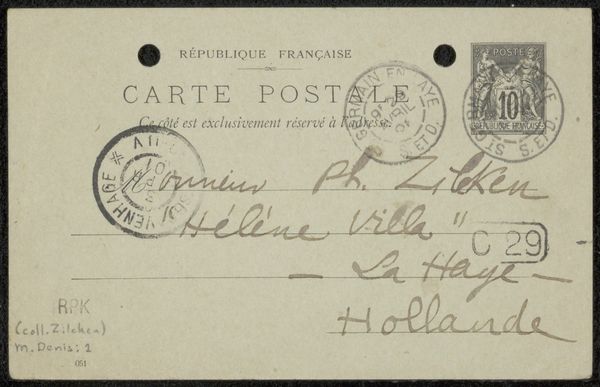
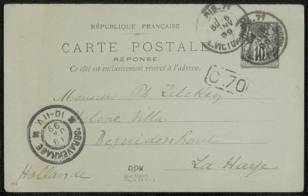
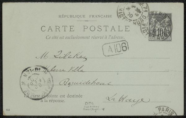
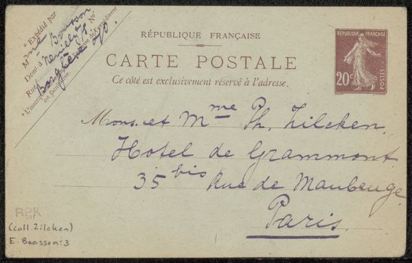
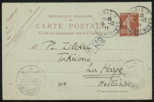
Curator: Here we have Isaac Israels' "Briefkaart aan Philip Zilcken," created sometime between 1875 and 1930. It's a drawing on paper, a quick correspondence captured on a small card. What strikes you about it at first glance? Editor: It has a certain quietness, a fragility. The fading script against the aged paper gives it a very intimate, almost melancholic feel. There’s something about the ephemerality of it that's quite poignant. Curator: Absolutely. The fading of the hand-lettering and overall visual texture evoke a sense of temporality. Consider that Israels was a prominent figure within the Dutch Impressionist movement. This brief postcard could represent a commentary on societal communication, class, and intimacy in an era rapidly undergoing industrial transformation. The script itself mirrors shifting social codes—a subtle blend of formality and the casual interactions of artists exchanging thoughts and building community. Editor: Focusing purely on form, I’m drawn to the relationship between the text and the empty space. The handwriting itself creates a composition of lines and curves against the pale background, almost like an abstract design. It's fascinating how typography can become almost sculptural. Curator: Indeed. Further analysis through a gendered lens opens compelling insights, since, throughout history, letter writing was frequently regarded as a medium to discuss topics women were traditionally excluded from. Though we might lack the sender’s gender here, the very selection and design of such a casual approach become meaningful choices—challenging norms that favored longer compositions. Editor: Shifting gears slightly, what is your take on the overall tonal range, since the limited values enhance that sense of quiet? I think the restriction reinforces the work's intimacy and fragility. Curator: An excellent point. Viewing the artifact as a whole encourages consideration of power relations in interpersonal exchanges. How does selecting a "Briefkaart" format affect intimacy, urgency, or convenience? In what ways would recipients of letters, rather than other media forms, affect one's social status? Editor: Well, thinking of it from that angle certainly shifts my initial impression. I saw fragility; now I’m thinking about the potential subversiveness inherent within such formats. Curator: Precisely! We begin appreciating not only the visual design but also its intersection with social power relations throughout history. Editor: Fascinating. I’ll definitely remember this new lens when looking at similar correspondence art in the future. Thank you!
Comments
No comments
Be the first to comment and join the conversation on the ultimate creative platform.
More like this