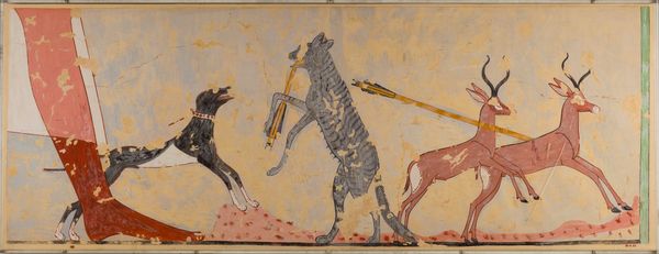
painting, watercolor
#
water colours
#
animal
#
painting
#
figuration
#
abstract
#
watercolor
#
abstraction
#
modernism
Copyright: Public Domain: Artvee
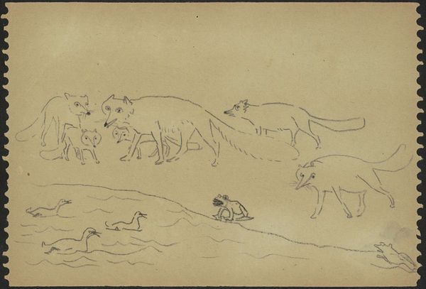
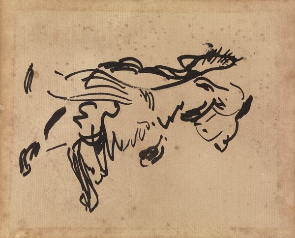
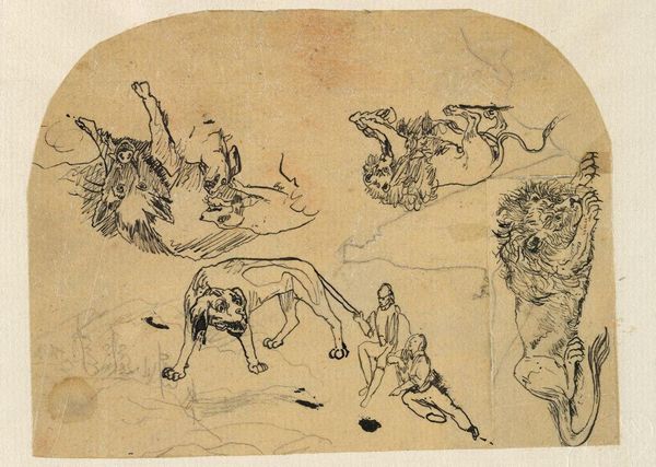
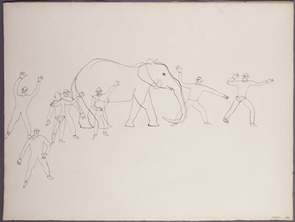
Editor: So, this watercolor on paper by Paul Klee, "A Pride of Lions," from 1924… The lions are rendered with such minimal lines, they almost look like diagrams. What's fascinating is how Klee reduced them to these structural elements, almost revealing their 'blueprint.' How do you read this piece? Curator: Well, look at the *making* of the lions. He's laid bare the process, hasn’t he? We see the mechanics, the linear frameworks… it reminds us of the materials – the ink, the brush, the paper. Klee’s less concerned with illusion and more interested in exposing the means of production. Consider how this challenges the conventional hierarchy – that of 'high art' versus, say, technical drawing, or even craft. It's about making the process visible, isn’t it? Editor: I see what you mean. The materials aren't just tools; they are the language. The lion is the subject, but the making of it is the *statement*. Do you think the child-like quality contributes to that feeling? Like showing not the finished form but how one goes about creating it? Curator: Exactly! The apparent simplicity masks a deep engagement with materiality and technique. Klee draws attention to the physical act, almost as if he were deconstructing the very *idea* of the lion. The economic and social implications, too – think about the labor involved, the accessibility of these materials, the very act of consuming art. Editor: So, it is more than just lions; it’s Klee showing us how they’re constructed, and in turn, subtly commenting on art-making itself. Curator: Precisely. It makes us think about the physical labor that underlies creative expression, as much as the symbolism of the animal itself. Editor: Thanks, I never considered the idea of labor and accessibility regarding what makes an artwork. That really changes the way I see the piece now.
Comments
No comments
Be the first to comment and join the conversation on the ultimate creative platform.
More like this