painting, plein-air, oil-paint
#
sky
#
painting
#
impressionism
#
plein-air
#
oil-paint
#
landscape
#
impressionist landscape
#
oil painting
#
ocean
#
seascape
#
post-impressionism
#
modernism
#
sea
Copyright: Public domain
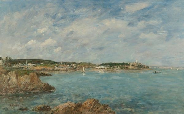
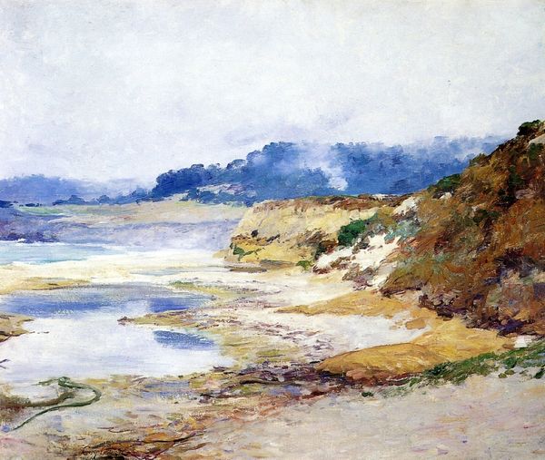
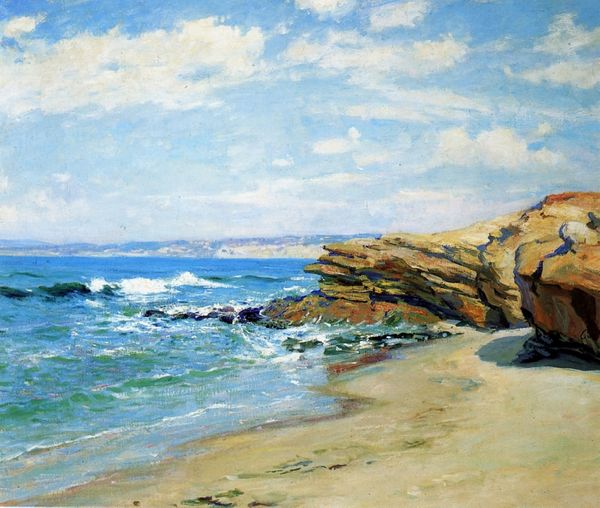
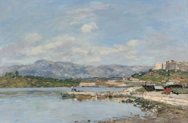
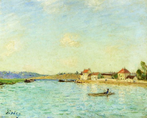
Editor: This painting, “Coastal Scene,” is by Robert Julian Onderdonk, probably painted en plein-air given its Impressionistic style. The layering of blues and whites really catches the eye. What stands out to you in terms of its visual language? Curator: The success of this composition lies primarily in its masterful manipulation of color and light. Observe how the chromatic intensity of the blue sea is subtly varied through brushstrokes, creating a palpable sense of depth. Similarly, the juxtaposition of light and shadow across the clouds lends them volume and dynamism. Editor: Yes, the light! I hadn’t quite thought of it that way. Are there specific formal devices he's using to create this effect? Curator: Note the artist’s deliberate use of broken color. Onderdonk does not blend the hues on the palette; rather, he applies small strokes of contrasting colours which, when viewed from a distance, coalesce to produce a vibrant and shimmering surface. Consider the texture; each mark seems intentional, contributing to the overall visual harmony. What is your interpretation? Editor: It's less about accurately portraying the scene and more about conveying an experience, a feeling of being by the coast, wouldn't you agree? This feels like what Impressionism is all about. Curator: Precisely. It's a formal rendering of lived experience, made up from abstract sensations that trigger emotive reactions. Did formal analysis change your mind at all? Editor: Definitely. I was mostly seeing the colors before, but now I understand how Onderdonk's use of brushstrokes and color variations adds so much more meaning. Curator: Indeed, by deconstructing the visual elements, we gain a deeper appreciation for the artwork's formal complexity.
Comments
No comments
Be the first to comment and join the conversation on the ultimate creative platform.
More like this