Dimensions: height 140 mm, width 199 mm
Copyright: Rijks Museum: Open Domain
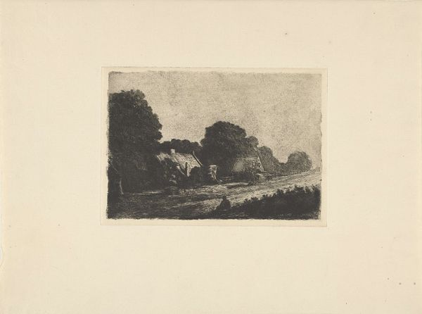
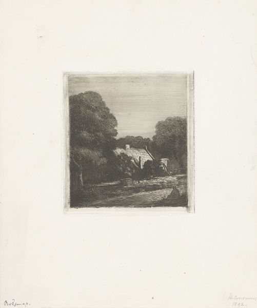
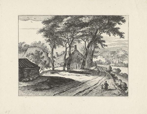
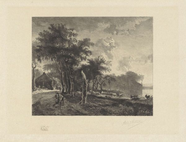
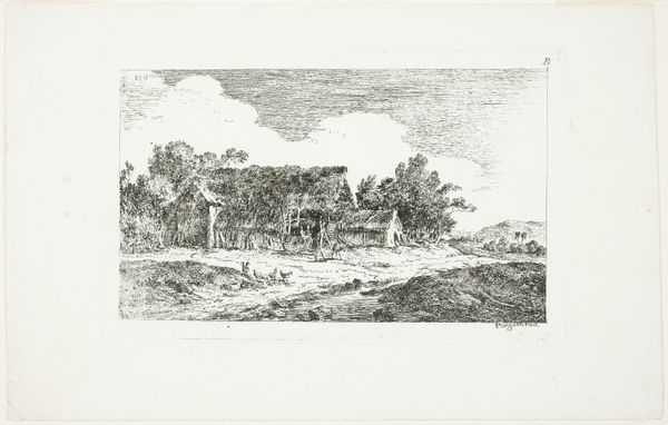
Editor: This etching, "Landweg bij Hilversum," created in 1892, intrigues me with its quiet depiction of a Dutch landscape. The composition seems very traditional. What elements of the scene's visual structure stand out to you? Curator: Note the strategic distribution of tonal values. How the dark masses of the trees create a repoussoir effect, framing the lighter central passage and thereby modulating spatial recession. The strategic application of cross-hatching in the foreground offers a textural counterpoint to the relative smoothness of the sky. How does that resonate? Editor: I hadn’t considered the balance of dark and light in that way. So the darkness isn’t just to make the trees look farther away, but also to help us focus on the farmhouse? It’s very subtle. Curator: Precisely. Consider, too, the linear qualities inherent to etching, creating sharp delineations that enhance form while also establishing a distinct atmospheric perspective. The controlled network of fine lines works as an organizing principle for the whole. Does the artist successfully weave narrative from such minimalist geometry, in your estimation? Editor: The texture makes the image more dynamic. So it's like there's an order. Even the sky has its own pattern made by the etching. Thank you, that helped me see how much the choice of texture matters. Curator: The formal grammar gives shape to an otherwise quotidian scene. Editor: Yes, exactly, the etching breathes life and gives new importance to this regular land view.
Comments
No comments
Be the first to comment and join the conversation on the ultimate creative platform.
More like this