painting, watercolor
#
art-nouveau
#
painting
#
landscape
#
figuration
#
watercolor
#
orientalism
#
symbolism
#
watercolour illustration
Copyright: Public domain
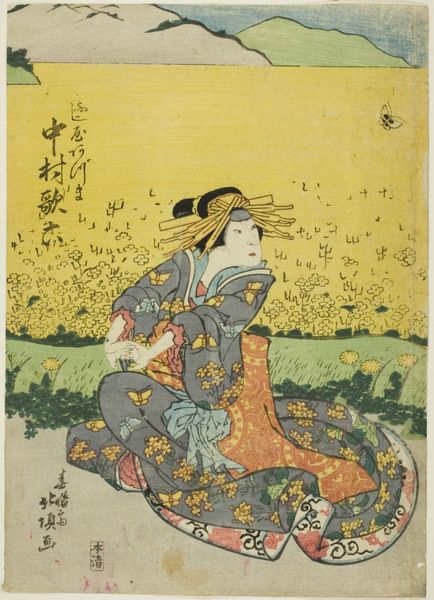
Harry Clarke made this illustration, 'The Year's at the Spring,' sometime in the early 20th century, probably with watercolor and ink. The way he lays down the colors feels so gentle, almost like he's breathing life onto the page. It’s amazing how he coaxes form and texture from such delicate washes. I can almost feel the texture of the paper, see the way the ink bleeds just a bit, softening the edges. Look at the little details like the tiny flowers and the way the light catches on the crane's wing, and how the red of the woman’s robe stands out against the soft green landscape. All of it is rendered with such care and precision! It reminds me a bit of Aubrey Beardsley's work. Both artists seem interested in pattern and the decorative. Yet, Clarke's touch is lighter, more airy. Anyway, it’s just a thought. Art's like a big conversation, always echoing and responding.
Comments
No comments
Be the first to comment and join the conversation on the ultimate creative platform.
More like this