Copyright: Public domain
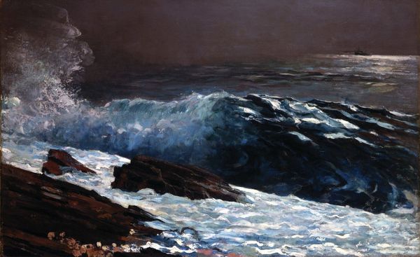
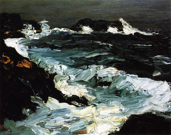
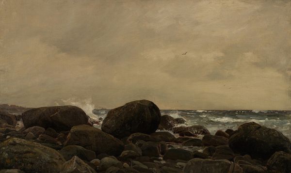
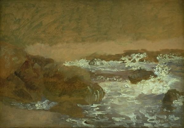
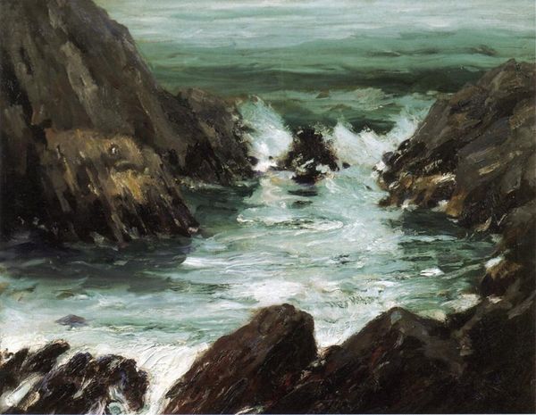
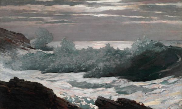
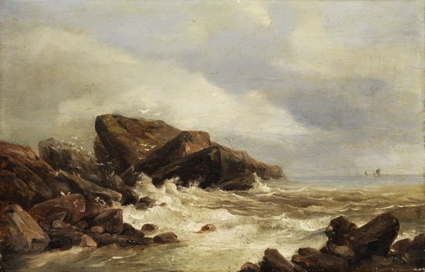
Editor: This is Winslow Homer's "High Cliff, Coast of Maine" from 1894, done with oil paint. It feels very dynamic; the jagged rocks contrast strongly with the foamy water. What draws your eye when you look at it? Curator: The structure is fascinating. Homer uses a compressed foreground, filling the canvas with the cliff face, and a much flatter background, which exaggerates the cliff's imposing scale. Notice how the diagonal lines of the rocks pull the viewer's eye upwards. Do you find the composition unbalanced? Editor: Maybe a little. The cliff feels so heavy on the right. Curator: Precisely. Now, consider the colour palette: predominantly browns and greys, with those vigorous white and turquoise accents in the crashing waves. It isn’t simply representational; how does the colour affect your reading of the work? Editor: It makes the scene feel turbulent, maybe even threatening. The limited colour range emphasizes the raw power of the scene. Curator: The paint application is also quite striking. Observe the broken brushstrokes, the visible texture of the impasto. It’s representational, yes, but it also draws attention to the physicality of the paint itself, asserting its materiality. Homer isn't just depicting a scene; he's crafting a visual experience. Does focusing on these aspects change how you interpret the piece? Editor: Definitely. I initially saw it as a landscape, but looking at it this way makes me appreciate the abstract qualities and the pure visual impact of the paint and structure. Curator: Exactly! Sometimes it’s crucial to put aside narrative and cultural baggage to focus on what's in front of you and the way in which its crafted. It’s often more telling than intended subject matter.
Comments
No comments
Be the first to comment and join the conversation on the ultimate creative platform.