Copyright: Public domain
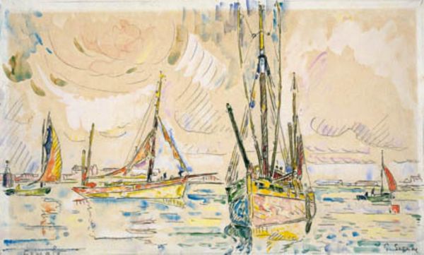
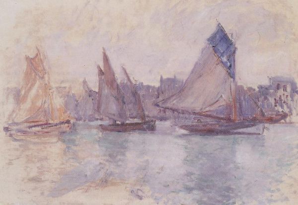
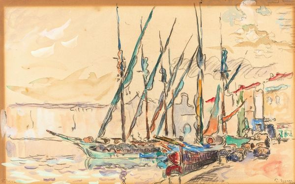
Editor: Here we have "Yachts at Royan," created by Odilon Redon in 1902, believed to be in pastel. It has such a dreamlike, hazy quality; what strikes you most about its composition? Curator: Initially, I’m drawn to Redon’s command of form and the subversion of traditional representational strategies. Observe how the masts of the yachts, rendered with delicate lines, pierce the composition. Editor: They really do draw the eye upwards! Almost like musical notations, reaching for a higher register. Curator: Precisely. Note also how the application of pastel is far from descriptive; it is, rather, a deployment of color to invoke feeling. Do you perceive a deliberate use of dissonance in the color choices? Editor: I see a subtle clash between the warmth of the sails and the coolness of the water and sky. It gives it some tension, which is interesting. Is that intended to evoke…discomfort? Curator: Not necessarily discomfort, but perhaps a deliberate ambiguity. The interplay of light and shadow suggests a fleeting moment. Notice how Redon’s use of broken color lends itself to a surface rife with nuanced texture and visual intrigue. Does this reading impact your initial perception? Editor: Absolutely, focusing on the colors and the construction adds to that dreamy effect. The tension almost dissolves into the beauty of it all. Curator: Indeed. By foregrounding the materiality of the medium and challenging representational norms, Redon invites us to engage in an aesthetic experience rooted in visual analysis. Editor: That's really helpful! It’s amazing how much can be communicated by color and form. Curator: Indeed. Through such close visual scrutiny, the work yields endless interpretations.
Comments
No comments
Be the first to comment and join the conversation on the ultimate creative platform.
More like this