Dimensions: 107 x 93 cm
Copyright: Public domain
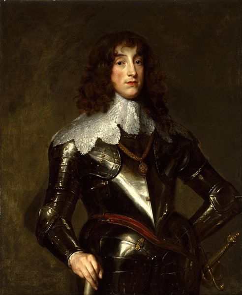
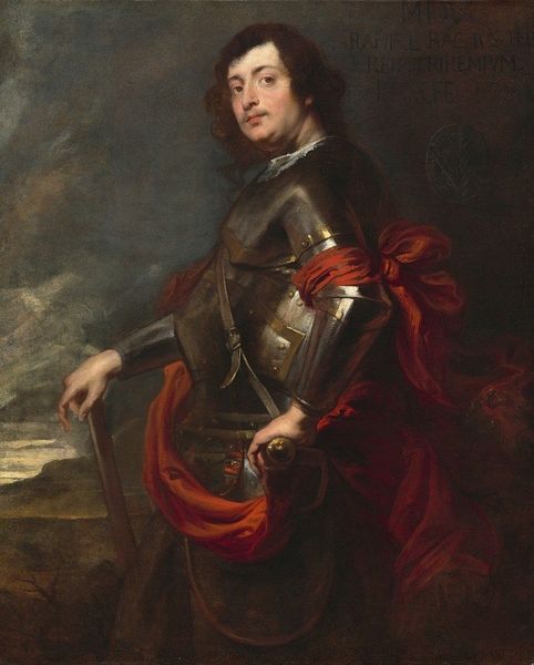
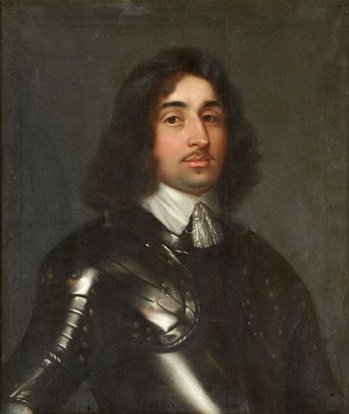
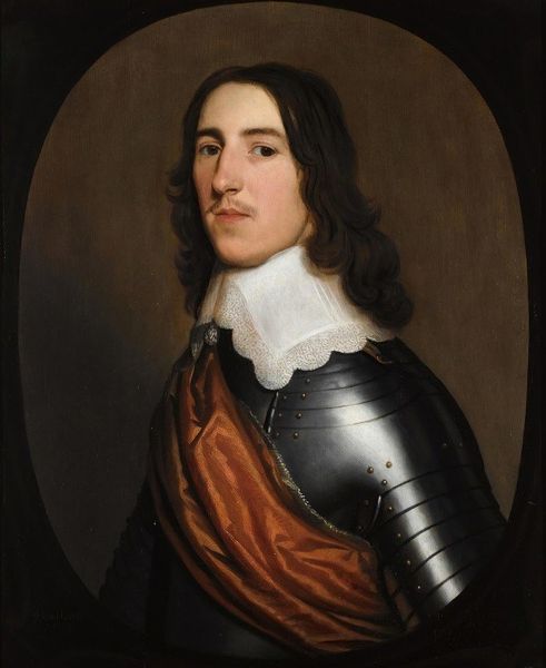
Curator: Here we have Anthony van Dyck’s portrait of Prince Charles Louis, Elector Palatine, dating from 1641. Editor: The chill of the steel armor jumps out. It dominates the composition; hard, gleaming surfaces, juxtaposed with a kind of foppish ease. Curator: Van Dyck was a master of Baroque portraiture, deeply influenced by his time in Italy, and this work really speaks to the way court portraiture functioned in the 17th century. This painting reinforced power; Charles Louis was vying for influence amidst considerable political upheaval. Editor: It's more than just conveying power; it's about material spectacle. Think of the armorer's labor, the cost of the materials themselves. Armor like this becomes wearable wealth, and it turns the sitter into a kind of manufactured icon. Curator: Precisely! This isn't just armor; it’s a statement about Charles Louis's claims to authority at a tumultuous time in Europe. The Thirty Years' War was raging. Van Dyck, serving as court painter for the English monarchy, understood the symbolic weight such a portrait carried. Editor: What strikes me is the contrast, though. The luxurious fabrication of the armor is obvious, but there is almost a vulnerability suggested by his face, framed by soft hair. His stance looks contrived as if posing is a chore. He hasn't quite grown into this metal skin he's inhabiting. Curator: A fair point. While Van Dyck presents the Prince as a figure of power, the subtle human elements soften the overall impression, hinting at a certain precariousness both personal and political. Editor: So the material grandeur masks the reality of a ruling class facing change, then? The brushwork hides any weakness in the fabrication. Curator: Absolutely. Van Dyck uses all the tricks of his trade. Editor: It's a study in contrasts then, this work; armor versus vulnerability, soft flesh, versus hard metal, material extravagance versus a kind of… awkward humanity. Fascinating. Curator: Indeed. The play of surface and meaning is exactly what makes it such a compelling piece of propaganda.
Comments
No comments
Be the first to comment and join the conversation on the ultimate creative platform.