Copyright: CC0 1.0
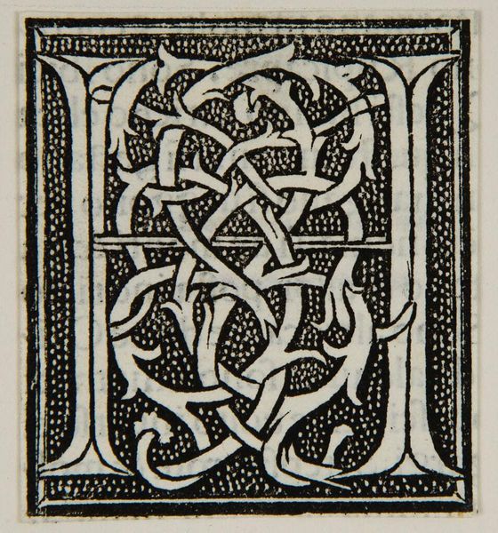
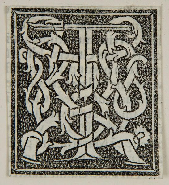
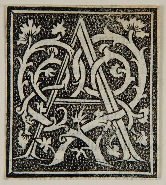
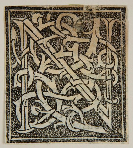
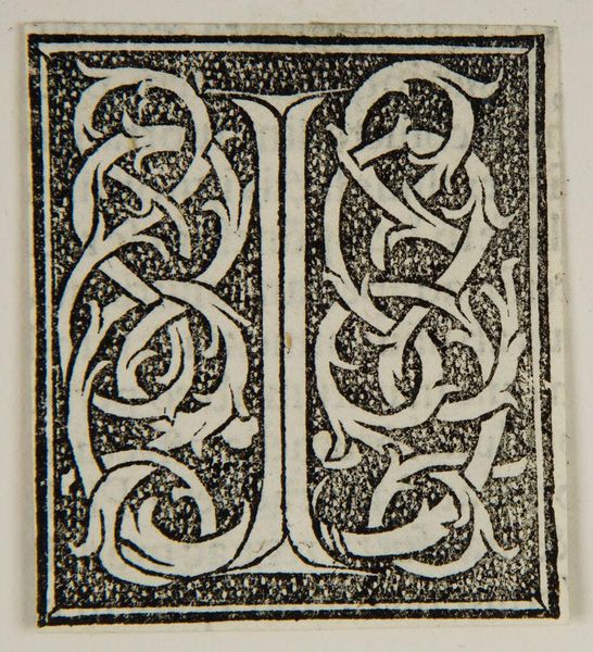
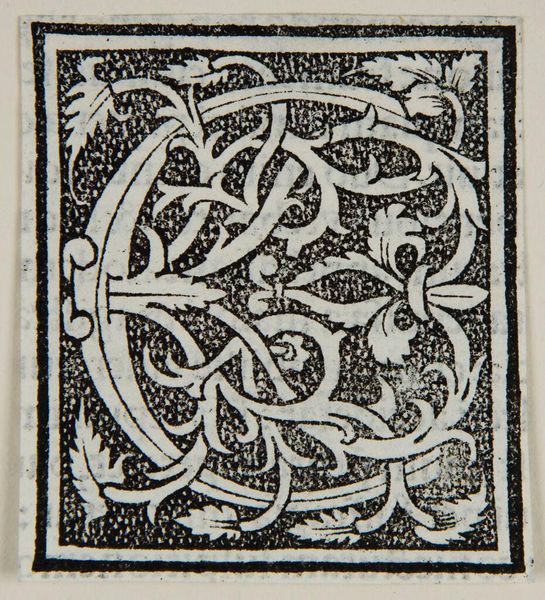
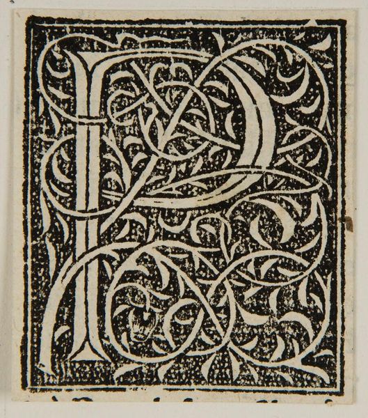
Editor: Here we have an initial "M" by an anonymous artist. It's a very intricate design. What do you see in this piece? Curator: The interplay between positive and negative space dictates our reading of the letter. Note the careful execution of line and form; the density of the black background throws the elaborate letter forward. Editor: So it's about the shapes and how they interact more than the meaning of "M"? Curator: Precisely. The artist's objective isn't literal representation, but exploration of form and balance. Consider how the texture of the background enhances the smooth, flowing lines of the letter itself. Editor: I hadn't thought about it that way. I was so focused on trying to decode the letter. Curator: It's a lesson in seeing beyond immediate subject matter to appreciate the formal elements at play.
Comments
No comments
Be the first to comment and join the conversation on the ultimate creative platform.
More like this