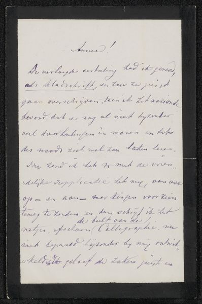
drawing, paper, ink
#
drawing
#
script typography
#
hand-lettering
#
editorial typography
#
hand drawn type
#
hand lettering
#
paper
#
ink
#
hand-drawn typeface
#
stylized text
#
thick font
#
handwritten font
#
word imagery
Copyright: Rijks Museum: Open Domain
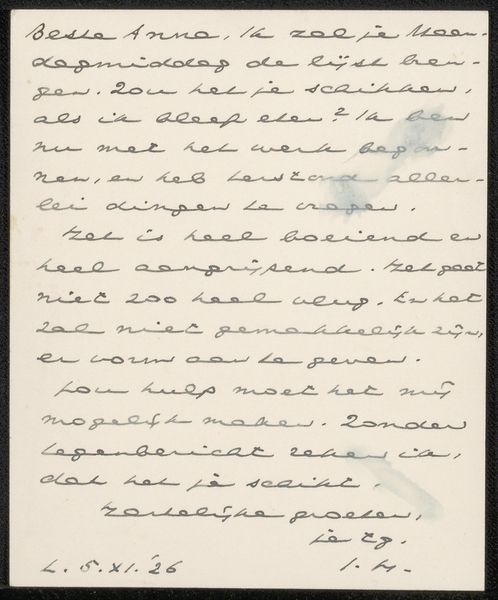
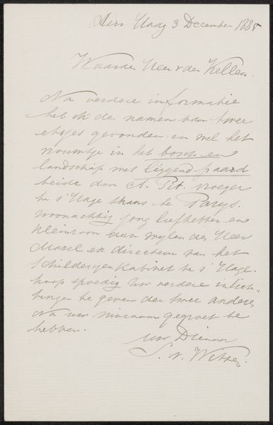
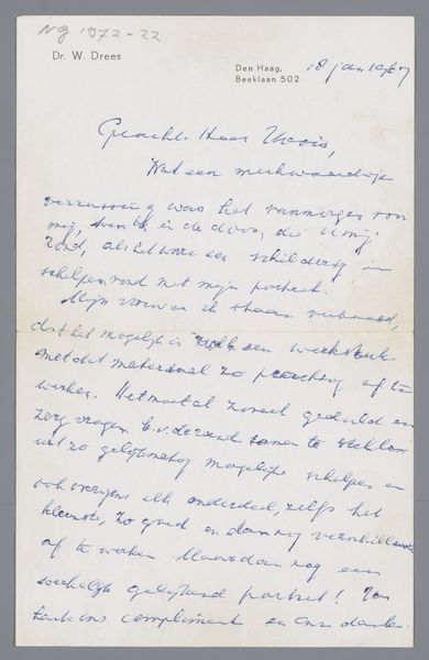
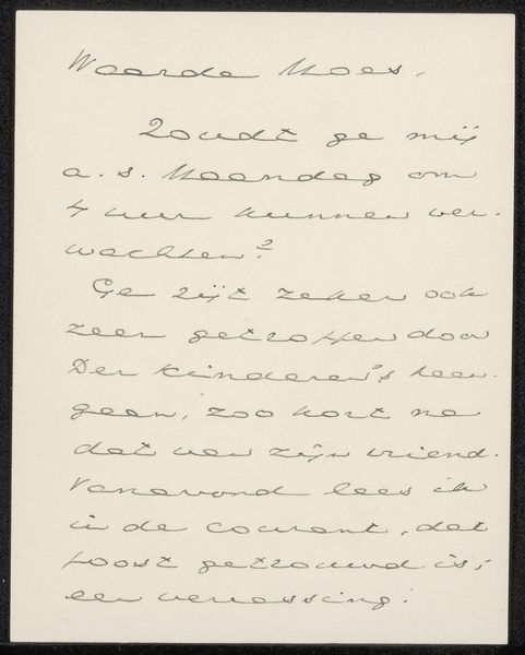
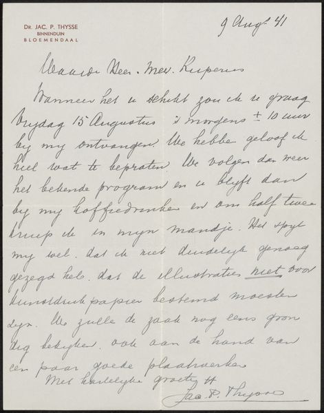
Curator: Here we have "Brief aan E.H. van Sonsbeek," potentially from 1956, by Olde Kokoschka. It's rendered in ink on paper. What are your initial thoughts? Editor: There's an endearing intimacy in its script. I love the imperfections, you know? It gives a glimpse into the artist’s personality, a sort of friendly vulnerability. Curator: Precisely. The medium itself lends to this immediacy. The ink on paper – simple, direct. Semiotically, it bridges the artist and recipient directly. Note the letter's construction, its very particular handwriting... Editor: It's like eavesdropping on a conversation between old friends, even down to the comment about “holiday at home." It makes you wonder about their connection and makes the handwriting almost like another character within that relationship. Curator: The placement of "O. Kokoschka, Villeneuve" suggests the origin, rooting the script in a specific locale, while the date fixes it historically. It provides both personal and formal context. The tone is also one of sincere care. Editor: Absolutely. You sense a real concern for maintaining a bond. Also, from a pure compositional standpoint, the text density, the generous leading between lines creates an interesting rhythm – visual breath, in a way, or perhaps… the hesitation in putting feelings into writing? Curator: It speaks to a temporality, that sense of capturing time itself – of life unfolding. The “muddled” mail could easily symbolise much more. The simple materials emphasize the artist's rawest intent: a pure desire to connect. Editor: True. And thinking of raw intent reminds me—when art speaks plainly like this, it whispers loudly. Looking again now, the handwritten quality is almost daring because it feels vulnerable, like baring their soul in the casual messiness. That makes it beautiful, somehow more precious and true. Curator: An elegantly untamed expression of sentiment—I concur entirely. Editor: And maybe that's what draws us in… the allure of honest imperfection.
Comments
No comments
Be the first to comment and join the conversation on the ultimate creative platform.
More like this