Dimensions: height 264 mm, width 382 mm
Copyright: Rijks Museum: Open Domain
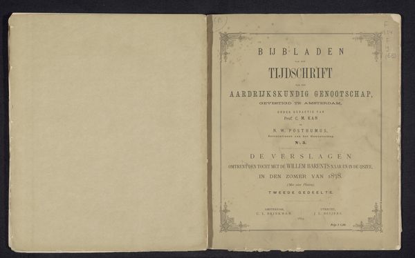
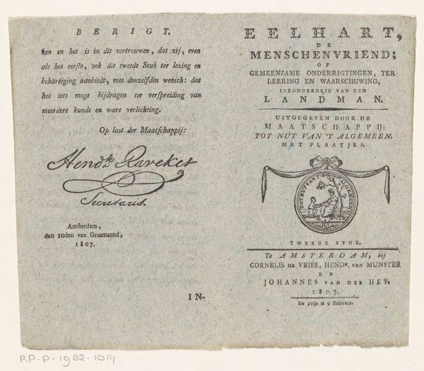
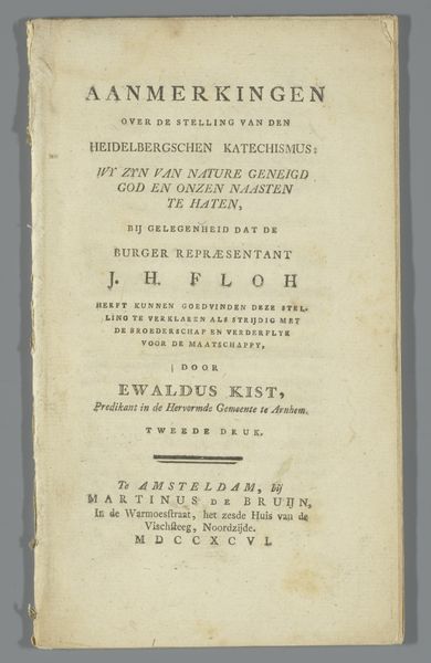
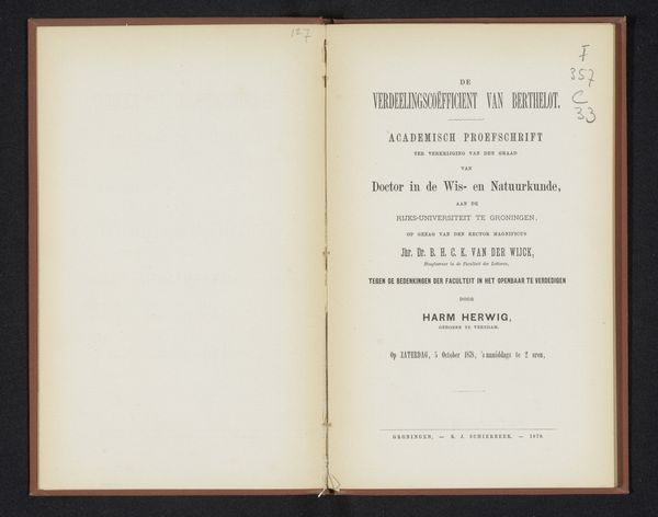
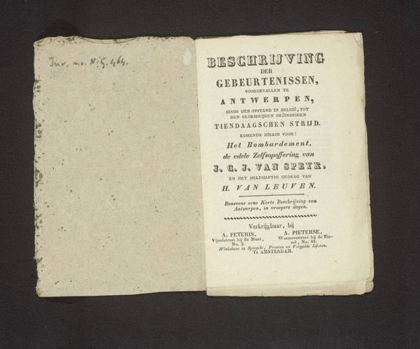
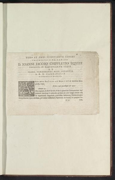
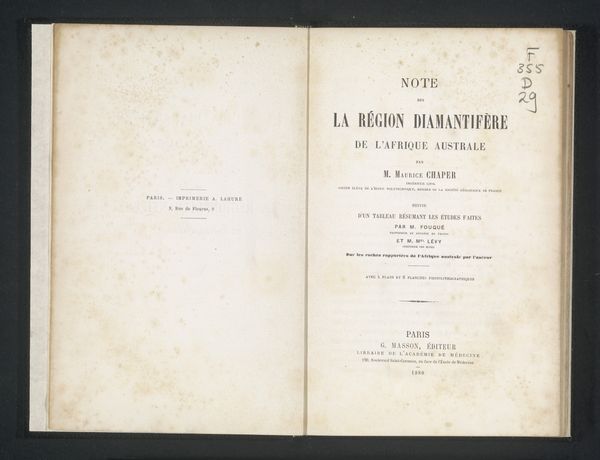
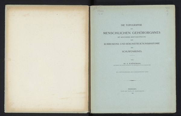
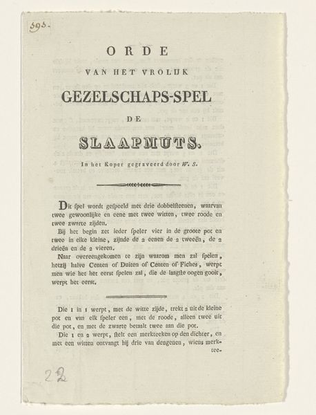
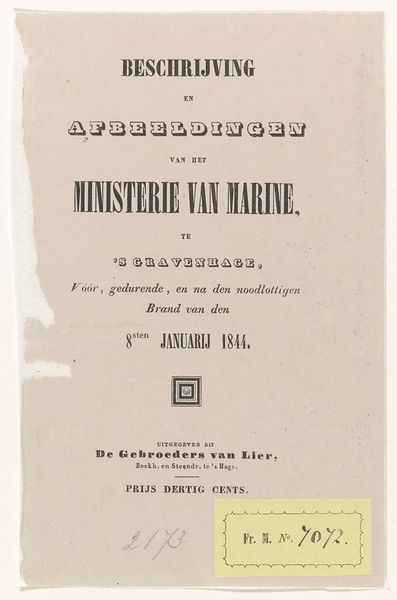
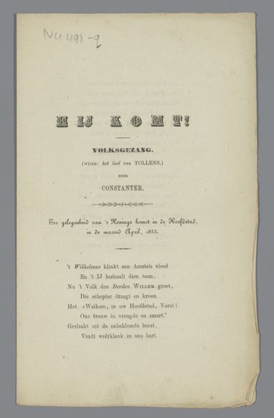
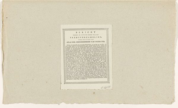
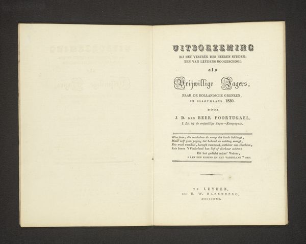
Curator: This is the title page for "Vues de Mannheim," created in 1782 by the Klauber brothers, a testament to the power of collaborative artistic vision. Editor: The first thing that strikes me is its delicate quality. The subtle gradations of tone and the aging of the paper add a wistful beauty to what is essentially a piece of functional typography. Curator: Indeed. But it’s much more than mere typography. Think about Mannheim at the time: a burgeoning center of the Enlightenment. This title page announces a series of city views, framing Mannheim as a subject worthy of artistic representation. It invites exploration, projecting power through visual language. Editor: That's a compelling reading, but let's consider the form itself. The arrangement of text creates a hierarchy, visually organizing information. The contrasting typefaces and their spacing guides our eye, almost choreographing the reading experience. Curator: Agreed, yet the very act of commissioning these “views” speaks to a specific social and economic context. Who were the intended consumers? The rising merchant class, eager to assert their place in a society undergoing rapid transformation? How did this image contribute to a collective understanding – and perhaps even a glorification – of urban life and its political underpinnings? Editor: Certainly, those are important questions to consider. Still, the elegance of the Baroque style, so evident in the flowing lines and ornamental flourishes, enhances its message with an elevated visual tone. Note the symmetrical layout; it presents a controlled, almost idealized perspective. Curator: The choice of presenting Mannheim in this meticulously planned series also speaks to power dynamics – who controls the narrative? By showcasing only certain aspects, it may selectively omit the poverty or struggles inherent within a city rapidly expanding through exploitation. It becomes crucial to delve into the socio-economic underpinnings, and examine what's *not* being represented. Editor: An important point. Looking at the typography, you get a sense of a historical approach to layout. It would be great to delve into the original printing blocks that made the construction of this piece possible. Curator: Exactly! So, while we admire its aesthetic qualities, let's also contextualize "Vues de Mannheim" within its historical, social, and political frameworks. Art holds beauty *and* reflects, and impacts, humanity in context. Editor: Well said. Looking at the layout, it's clear it provides a certain controlled aesthetic pleasure.
Comments
No comments
Be the first to comment and join the conversation on the ultimate creative platform.
