#
photo of handprinted image
#
aged paper
#
lake
#
toned paper
#
light pencil work
#
water colours
#
ink paper printed
#
white palette
#
watercolour illustration
#
tonal art
#
watercolor
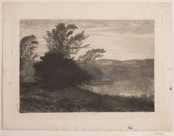
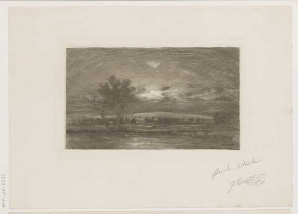
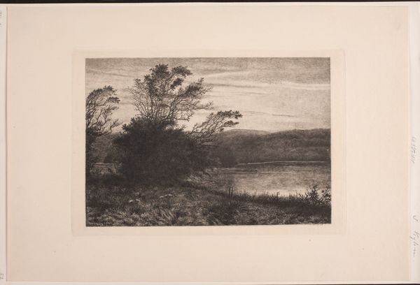
Dimensions: height 329 mm, width 270 mm
Copyright: Rijks Museum: Open Domain
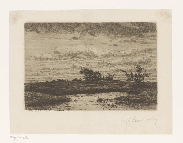
Editor: So, here we have "Water bij maneschijn," or "Water by Moonlight," by Omer Coppens, made sometime between 1874 and 1909. It looks like a watercolor illustration, perhaps with ink, on aged paper. It has a melancholic stillness to it. What strikes you when you look at this work? Curator: The most immediately arresting formal element is, of course, the stark division of the composition. Consider the dramatic interplay between the dark mass of the treeline and its almost mirror-image reflection in the water. This mirroring, along with the high horizon line, creates a sense of claustrophobia. Editor: Claustrophobia? It felt peaceful to me! Curator: Observe how the artist employs a limited tonal range, predominantly blacks and grays. Even the moon seems veiled, its light diffused by the heavy cloud cover. There is little dynamism in the brushwork; each stroke serves to reinforce the stillness you noted. Editor: Yes, it’s quite muted. Do you think that adds to the emotional impact? Curator: Absolutely. The lack of vibrant color removes the viewer from a sense of immediacy. This is not a snapshot of a lively scene, but a meditation on form and shadow. Are you familiar with any theoretical basis for discussing affect without explicit intention? Editor: I'm vaguely aware; semiotics touches on that, doesn't it? That's all very interesting; thank you. Curator: Indeed, it does. Looking closely, the structural integrity seems built into every aspect. A perfect exercise in tonal discipline and suggestive meaning, even if, perhaps especially if, that meaning eludes us somewhat.
Comments
No comments
Be the first to comment and join the conversation on the ultimate creative platform.
More like this