print, typography
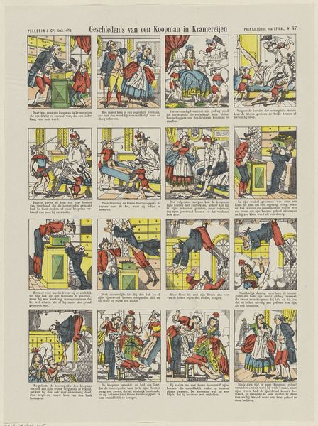
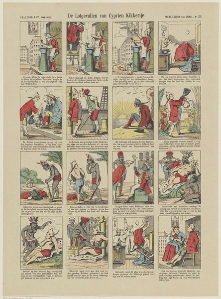
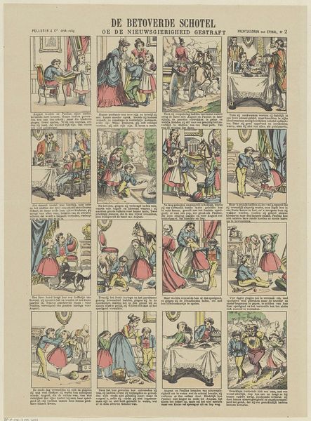
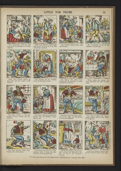
narrative-art
typography
comic
genre-painting
Dimensions: height 395 mm, width 295 mm
Copyright: Rijks Museum: Open Domain
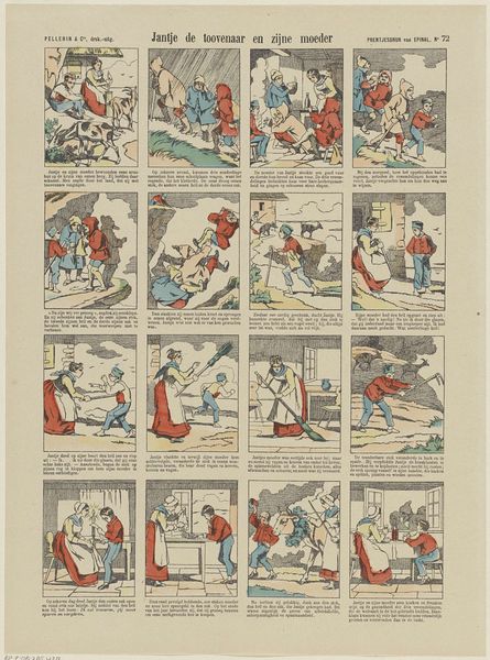
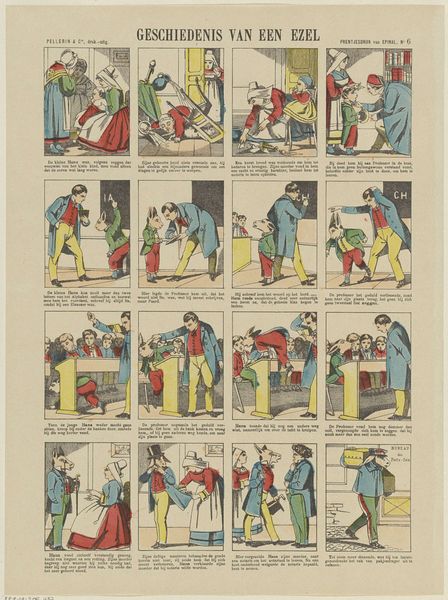
This narrative print of Kapitein Goedkind, or Captain Goodchild, by Pellerin & Cie., is a lovely example of a time when people used printed images to tell a story. The colours are quite muted, mostly blues, greens and browns. They seem to have been applied using a simple, almost industrial process. Look at the figures, they are crisply outlined in black, and then filled with a thin wash of colour, almost like a child's colouring book. The sea in panel five is interesting, rendered as repeating curves in a darker shade of blue, a lovely example of the way printmakers rely on the basic elements of mark making to convey depth and movement. I'm reminded of the work of Utagawa Kunisada, the great Japanese woodblock artist, who also used bold outlines and flat colour to create images for the masses. Of course the subject matter is entirely different, yet both artists were working within a commercial framework and both managed to create compelling works of art. Ultimately, art making is an ongoing conversation, a visual dialogue between artists, artworks, and audiences.
Comments
No comments
Be the first to comment and join the conversation on the ultimate creative platform.